Logo De Kredietmakelaar
Contest details:
- Contest holder: jorritdrenth
- Category: Logo design
- Total budget: € 305.00
- Start date : 12-11-2014 13:40
- Ending date : 26-11-2014 13:36
- Status : Ended
- Required formats: jpg,ai,pdf
- Relevant files: None
-
Available languages:


- Number of designs: 88
-
Response rate:
low high
Needs:
Company description:
We are a "serviceprovider" for insurance agencies in the Netherlands. These insurance agencies have customers (consumers) who are looking for a consumer finance solution. Our company
Target group:
Business to business
Colors, favourites and other requirements
yellow and blue. Please look for the colors on our website www.dekredietmakelaar.nl. Colors are RGB on the website.
DUO
-
-
Description by designer DUO:
Other adaptation - sincerely DUO
-
This contest is finished. Its not possible to reply anymore.
-
-
-
Description by designer DUO:
Other adaptation - sincerely DUO
-
This contest is finished. Its not possible to reply anymore.
-
-
-
Description by designer DUO:
An web site application - sincerely DUO
-
This contest is finished. Its not possible to reply anymore.
-
-
-
DUO says
Thank you for giving me the opportunity to work on your behalf, which I find very interesting, feel free to give me your feelings, hoping that my work will make you react positivemenet - Sincerely, DUO
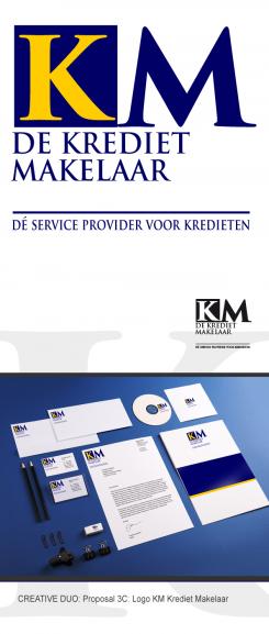
For this proposal, I wanted to give the feeling of acting out "commitment" thanks to the contrast between the blue and white block - DUO -
DUO says
Thank you for your rating, feel free to give me feedback, even vague, I know the traduires in graphic design. I think separate Krediet and Makelaar expression allows to give two major information - the first shows the average, the second presents the profession, expertise. It not get one without the other, so there is a strong identity service.Sincerely, DUO
-
This contest is finished. Its not possible to reply anymore.
-
-
-
DUO says
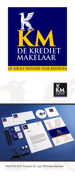
In this proposal, I wanted to give an "institutional" image, the very positive symbol of antiquity Griffin gives a sense of protection, guard. DUO
-
This contest is finished. Its not possible to reply anymore.
-
-
-
DUO says
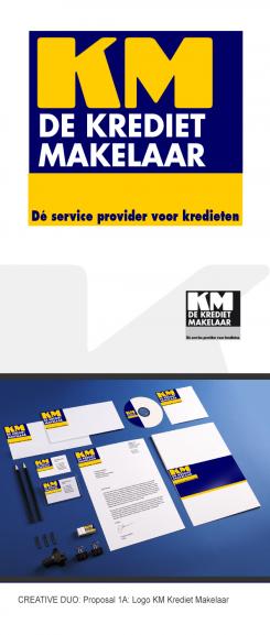
In this proposal, I wanted to give an accessible picture to credit for all - so quite neutral and particularly signage and visual as powerful as the sign "stop" - DUO
-
This contest is finished. Its not possible to reply anymore.
-


