Logo design for design hotels group
Contest details:
Bronze
- Contest holder: Michael Struck
- Category: Logo design
- Total budget: € 199.00
- Start date : 08-02-2013 17:47
- Ending date : 15-02-2013 17:27
- Status : Ended
- Required formats: jpg,ai,pdf
- Relevant files: None
-
Available languages:


- Number of designs: 116
-
Response rate:
low high
Needs:
Brand name: Ruby
Character/style:
- Laid-back
- Modern
- Uncomplicated
- Authentic
- With humor and a dash of self-irony
- Caring
- Sensual
- Style-conscious
Company description:
Logo design for up-and-coming design hotels group with hotels in major cities and metropoles, as well as resorts in trendy lifestyle destinations.
Target group:
Positioning: All that you care for, in style. Nothing else. Finally.
Target groups: Modern and post-modern milieus, that care for the following:
- things that have soul
- aesthetical perfection
- sensual attraction
- uniqueness
- the newest on the market
- seducing me to dream
Among these milieus, women are a core target group.
Colors, favourites and other requirements
- Logo needs to work in two ways -- a) Only "Ruby" and b) "Ruby" in conjunction with a product identifier, e.g., "Ruby Nights". The product identifier should be easiliy distinguishable from the brand name, f. ex. by using different font weights.
- Regular use of capital letters at beginning of words, and small letters for rest(not all in capitals, not all in small letters)
Hypothesis: Due to the positioning and target group characteristics, use of longhand and potentially even handwriting may work well.
pitdesigns
-
-
Description by designer pitdesigns:
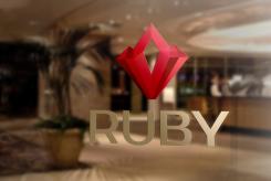
Concluding i have made an impression of the logo on the glass window of an hotel.
-
This contest is finished. Its not possible to reply anymore.
-
-
-
Description by designer pitdesigns:
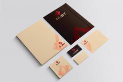
Here you can see an impression of how the logo can be used.
-
This contest is finished. Its not possible to reply anymore.
-
-
-
Description by designer pitdesigns:
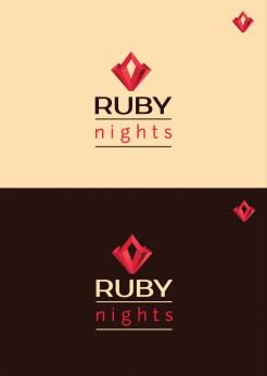
In addition i have made a version of the logo with a product identifier.
-
This contest is finished. Its not possible to reply anymore.
-
-
-
Description by designer pitdesigns:
Hello,
This is my interpretation of what Ruby should look and feel like. When picking the colors i have also kept it in mind. Red stands for sensual and caring while the champange in combination with dark brown gives it a laid back look while staying modern. I have tried to keep the logo element simple while maintaining the shininess a ruby should have.
I hope and think i have captured all the chararistics in the logo.
I have also made some impressions of how it would look like when used in real life.
If you have any suggestions and/or feedback please let me know!
Kind regards,
Robin Pit -
This contest is finished. Its not possible to reply anymore.
-


