Logo design for Fiboni.com
Contest details:
Silver
- Contest holder: Fiboni
- Category: Logo design
- Total budget: € 299.00
- Start date : 11-06-2013 19:59
- Ending date : 18-06-2013 11:00
- Status : Ended
- Required formats: jpg,
- Relevant files: None
-
Available languages:


- Number of designs: 79
-
Response rate:
low high
Needs:
We are looking for an original, uncluttered logo that is easy to identify for Fiboni.com.
Fiboni is an educational blog/news site about nature, astronomy and science, art, culture and life style etc
The logo has to fit in the white space on the top of the page and in dark gray at the bottom in the footer.
Personally I like the simplicity of the verge logo on www.theverge.com
I think this will look best, but if you have other ideas that might fit the layout of the site, please show them.
(optional)
a thumbnail sized logo 200x200 (squared) for social media profiles, forums etc that is also original and captures the essence of the designed logo for the main page of Fiboni.com
Example:
www.facebook.com/ThisIsTheVerge
I have seen a lot of great designs here and I am hoping that you'll blow me by your creativity.
Kind regards
Company description:
Fiboni spirals out to connect the extremes in nature, astronomy and science, art, culture and life style with a large dose of fun. Its mission is to offer condensed information, feature stories, breaking news coverage, and community content in a unified and cohesive manner for the willing to educate their mind.
Target group:
15-25 year
55% Female 45% male that like getting cool facts and phenomena happening in nature.
Colors, favourites and other requirements
Prefer blue, green, black & white. No pink :)
toineaerts
-
-
Description by designer toineaerts:
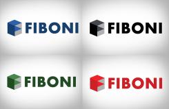
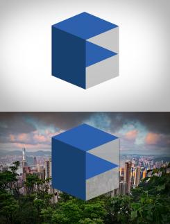
The geometric-like shapes stand for the connection Fiboni has between it's fields of expertise and interests. It has the intension to generate the feeling for astronomy and science, art, culture and life style.
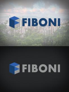
It's design is made to be symplistic and fits every background color setting.
The design matches with the age of the target audience. -
toineaerts says
The different color setting (3 different colors) in the cuboid shape represents the first letter of Fiboni, the F. Just like the example of The Verge this will be recognized as a trademark and branding of Fiboni. The gray background within the cubic sign can be transparent or solid in color.
The "fat/bold" font type and simplicity of the cube makes it possible the be easy seen and visible on big distances and small screens. Which is a must during this time of mass-usage of mobile devices. -
This contest is finished. Its not possible to reply anymore.
-
-
-
Description by designer toineaerts:
The geometric-like shapes stand for the connection Fiboni has between it's fields of expertise and interests. It has the intension to generate the feeling for astronomy and science, art, culture and life style.
It's design is made to be symplistic and fits every background color setting.
The design matches with the age of the target audience. -
toineaerts says
The different color setting (3 different colors) in the cuboid shape represents the first letter of Fiboni, the F. Just like the example of The Verge this will be recognized as a trademark and branding of Fiboni. The gray background within the cubic sign can be transparent or solid in color.
The "fat/bold" font type and simplicity of the cube makes it possible the be easy seen and visible on big distances and small screens. Which is a must during this time of mass-usage of mobile devices. -
This contest is finished. Its not possible to reply anymore.
-


