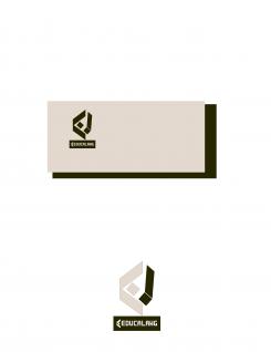
LOGO FOR A FRENCH LANGUAGE SCHOOL IN PARIS (french for foreigners): EDUCALANG
Contest details:
Bronze
- Contest holder: Nicolas MOREAU
- Category: Logo design
- Total budget: € 229.00
- Start date : 10-12-2015 09:49
- Ending date : 08-01-2016 09:46
- Status : Ended
- Required formats: jpg,psd,pdf
- Relevant files: None
-
Available languages:


- Number of designs: 233
-
Response rate:
low high
Needs:
Company description:
Educalang is a French school for adult foreigners based in Paris. We offer French courses of all types: intensive (one week), extensive, immersion with cultural activities, shows, fashion, food, etc.
The school's philosophy is based on the following principles: modern teaching methods (promoting real interaction context), complete immersion in France, tailored programs (100% language or language & culture).
Target group:
Adults (20-40 years target) of all nationalities coming to France for a period of one week to six months and wishing not only to learn French but also to discover the French culture, to stay with a French family and understand the culture from the inside.
We are targeting an audience of young professionals who, despite being able to afford a language course in France, are looking for quality services at reasonable price.
Colors, favourites and other requirements
The colors have to be trendy, discrete enough but referring to a school that has character and where quality is a priority, where the atmosphere is good and where teaching methods are modern.
No blue/white/red combination, no French flag, no Eiffel Tower (except if the design only suggest the Eiffel Tower without showing it too evidently).
We'll choose the most efficient colours/typo combination.
zarkovzi
-
-
Nicolas MOREAU says :
Thank you for this proposals. I'm afraid it does not meet our requirements yet, in terms of colors and design.
We expect to have modern colors and a avoid straight lines, especially geometrical ones.
Thank you in advance for your new proposals.
Best regards,
NM -
Nicolas MOREAU says :
Thank you for this proposals. I'm afraid it does not meet our requirements yet, in terms of colors and design.
We expect to have modern colors and a avoid straight lines, especially geometrical ones.
Thank you in advance for your new proposals.
Best regards,
NM -
This contest is finished. Its not possible to reply anymore.
-

