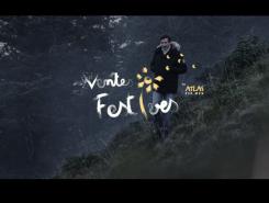
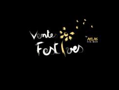
Logo for a new concept launched by the brand Atlas For Men.
Contest details:
Gold
- Contest holder: atlasformen
- Category: Logo design
- Total budget: € 479.00
- Start date : 18-05-2015 09:30
- Ending date : 16-06-2015 14:36
- Status : Ended
- Required formats: jpg,psd,ai,pdf
- Relevant files: None
-
Available languages:


- Number of designs: 420
-
Response rate:
low high
Needs:
The aim is to associate the new concept and logo of the "Ventes Festives" to the environment of the brand and maybe to integrate the existing logo to become "Ventes Festives by Atlas For Men"
What's the concept of "Ventes Festives"?
Every month Atlas For Men (AFM) will propose to its customers a selection of product on a short time like you can find it in private sales. The products of this selection will be products that the customers can't usually find on our website but that stays in the "outdoor" spirit of the brand (like a market place).
Every month will have a new theme, as an example in May AFM will push a selection of 3 barbecues and planchas.
Company description:
Atlas For Men is a brand that is sold with success in 8 countries in Europe (France, Germany, Netherlands, belgium etc.).
The brand is making clothes et accessories "Outdoor" for the people in love with the nature and the comfortable clothing on low price.
Leader on the market of the remote sales, AFM also became a major actor of the internet with its website www.atlasformen.com/
Target group:
Atlas For Men is for men who have a lifestyle cloth to nature et outdoor activities.
Our target is mainly male (60%) and senior (45/65 years old).
Our products are often in a promotion, we propose very attractive prices and our average basket is around 50€.
Colors, favourites and other requirements
monsieurni
-
-
Description by designer monsieurni:
Voici un exemple d'adaptabilité du logo.
-
This contest is finished. Its not possible to reply anymore.
-
-
-
Description by designer monsieurni:
Bonjour,
Voici ma proposition, J'ai conçu une typographie qui rappelle l'identité de la marque. Proche de la nature, le i est un pissenlit, symbole éphémère des ventes que vous souhaitez proposer. Les couleurs peuvent facilement s'adapter à tous les supports. Le logo AFM peut aussi se positionner en dessous.
Faites moi part de vos remarques et de vos souhaits si cette idée vous plaît. -
atlasformen says :
Bonjour,
La typo est un peu trop "enfantine" et le symbole fleurie trop féminin.
Pour rappel notre cible est masculine et senior.
Merci -
monsieurni says
Je comprends vos critiques qui sont légitimes, cependant à défaut de vous convaincre, les femmes sont aussi susceptibles d'acheter sur votre site (Elles recherchent davantage les bonnes affaires et l’utilisation de coupons de réduction, soldes...etc) .
Quant au coté enfantin, je ne pense pas que ce soit un frein, la renault twingo (look très enfantin) est l'une des voitures préférées des seniors de ces 20 dernières années.
-
This contest is finished. Its not possible to reply anymore.
-


