Logo for a new digital content marketing agency
Contest details:
Silver
- Contest holder: Willem Breytenbach
- Category: Logo design
- Total budget: € 329.00
- Start date : 08-03-2014 12:43
- Ending date : 22-03-2014 12:41
- Status : Ended
- Required formats: jpg,ai,pdf
- Relevant files: None
-
Available languages:


- Number of designs: 136
-
Response rate:
low high
Needs:
Company description:
Target group:
Colors, favourites and other requirements
V_01
-
-
No comments
-
This contest is finished. Its not possible to reply anymore.
-
-
-
V_01 says
Here I change a icon a little bit, and I also change the colors to mach with the logo. Icon is simple and represent communication between you and your clients, and how do you give a solutions to the clients in the field of content marketing. I hope you understand, my English is not so great :)
Greetings
Vuk -
This contest is finished. Its not possible to reply anymore.
-
-
-
V_01 says
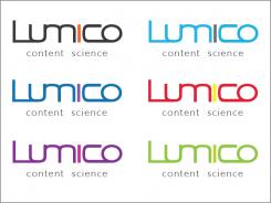
Here i try different colors on white background.
-
This contest is finished. Its not possible to reply anymore.
-
-
-
V_01 says
Hi!
I do the changes what you ask for. I hope you like it. If you wont other changes please post a comment.
Vuk -
This contest is finished. Its not possible to reply anymore.
-
-
-
V_01 says
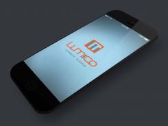
I brighten the design, and I make the icon. Please post a comment.
Greetings -
Willem Breytenbach says :
Hi V_01. We still really like your design. Maybe we explained wrong in regard to more colours. Can we take the original orange and grey and put it on white and mybe also see another colour scheme on white? Also can we change the tag line to "content science"
-
This contest is finished. Its not possible to reply anymore.
-
-
-
Willem Breytenbach says :
I like the design element with the 'i', but the overall look is too dark and i don't get a feeling for either the digital or content aspects. please brighten for us.
-
This contest is finished. Its not possible to reply anymore.
-
-
-
V_01 says
This is my design, simple and modern.
If you like it, or you wont some other changes, please post a comment.
Greetings
Vuk -
Willem Breytenbach says :
hi, the design is simple, but too a fault. i think there needs to be more digital elements and more colour.
-
This contest is finished. Its not possible to reply anymore.
-

