Logo for Measurement System: M-iQ Intelligent Measurements
Contest details:
Silver
- Contest holder: RicardoRail
- Category: Logo design
- Total budget: € 329.00
- Start date : 19-10-2015 09:29
- Ending date : 15-11-2015 11:26
- Status : Ended
- Required formats: jpg,ai,pdf
- Relevant files: None
-
Available languages:


- Number of designs: 86
-
Response rate:
low high
Needs:
Company description:
Ricardo Rail is an internationally operating company in (amongst others) the rolling stock branche. We offer, amongst others, technical advice and engineering services. Our key values are respect, integrity, creativity& innovation and passion. To enable some of our advices services we also perform measurements on trains, trams and metro's. To perform these measurements we have developed our own measurement system: M-iQ. For more information: www.ricardo.com & rail.ricardo.com.
Target group:
The logo should appeal to our customers: (technical) staff of international, rolling stock related companies. The logo should also appeal to staff at management level within these organisations.
Colors, favourites and other requirements
Primary colors:
- C100 M75 Y5 K0
- C0 M0 Y0 K40
- 100% black
Other accepted colors (try to use max 1 of the colors below in addition to the primary colors):
- C0 M66 Y89 K11
- C8 M98 Y100 K1
- C45 M0 Y100 K0
- C8 M58 Y100 K1
- C5 M3 Y100 K0
- C49 M85 Y0 K0
- C0 M0 Y0 K85
Primaire typefaces:
- Myriad Pro
- Humanist BT
See also attachment "Guidelines Ricardo Sub brands.png"
Richie
-
-
Description by designer Richie:
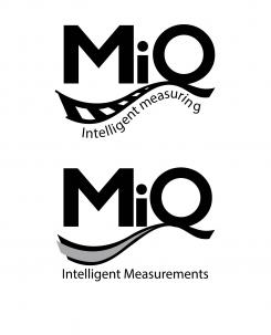
In this logo design again, I have used the typeface Humanist BT while distorting it bit from the original, so it becomes more interesting for the viewer.
In this design the terminal/hanger of the letter "Q" is connected with a stylized rail line (in the logo on top the rails are more visible but in on on the bottom creates a feeling of speed and precisio). The shape and form of the "rail line" gets the viewer to follow the design and the letters, which makes it more memorable and creative.
The colours used are black and grey, which makes the design simple, professional and serious, while the "rail line" makes it creative and flexible.
If you have any questions or suggestions, please let me know!
Best Regards,
Hristo -
This contest is finished. Its not possible to reply anymore.
-
-
-
Description by designer Richie:
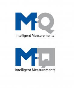
Here are two different versions of the same idea about the logo and the use of "negative space" for the connection of the letters while also putting the letter "i"
The colour schemeis the same as the previous logo, just the typefaces are a little bit different.
If you have any questions or suggesions, please let me know.
Best regards,
Hristo -
This contest is finished. Its not possible to reply anymore.
-
-
-
Description by designer Richie:
In this logo I kept the design as simple as possible while keeping it professional and creative. This makes the logo easy to read and understand but also memorable and distingushable.
I altered the Humanist BT typeface, which is used by your company, just enough to make it more interesting and memorable while keeping it recognizible.
The colours I used for this logo design represent the professionality of the company. While the use of the "white space" and the letter "i" makes it more creative and engaging.
If you have any questions and suggestions, please don't hasitate to share them with me.
Best Regards,
Hristo
-
This contest is finished. Its not possible to reply anymore.
-


