Logo for research project on physical activity!
Contest details:
Bronze
- Contest holder: Active2Gether
- Category: Logo design
- Total budget: € 199.00
- Start date : 22-08-2013 16:01
- Ending date : 22-09-2013 15:57
- Status : Ended
- Required formats: jpg,psd,ai,pdf,png,gif
- Relevant files: None
-
Available languages:


- Number of designs: 52
-
Response rate:
low high
Needs:
We're open to two kinds of logos:
(1) A logo that represents very clearly what our project is about: physical activity, young adults (18-25 yrs), social media, 'intelligent' system.
(2) A more abstract logo that represents what our project is about less explicitly, but that is appealing and recognizable.
We don't have a strong preference for either of the two types, but either way: we want something that looks nice (typo)graphically! Who'll make us happy?
Company description:
The research project Active2Gether is a collaboration between the department of Artificial Intelligence at the VU University in Amsterdam, the department of Biostatistics & Epidemiology at the VU Medical Center and Philips Research. Its objective is to design a system that motivates young adults (18-25 yrs) to be more physically active. The three key aspects of this system are: (1) physical activity, (2) influence of social networks and social media, and (3) innovation and intelligence.
Target group:
The logo is meant to provide the research project with a ‘face’ to the outside world. That means that the target audience is very broad, although it mainly consists of other researchers in related domains (Artificial Intelligence and Health Promotion). The logo could also be used in recruiting potential users of the system, so it should also appeal to young adults of 18 to 25 years old. Possibly, we will also use the logo for the system’s app in the iTunes app store and the Google Play store.
Colors, favourites and other requirements
The logos of all parties involved are predominantly blue, so it seems logical to show these colors in the logo of Active2Gether as well. However, this is no requirement: we are open to other suggestions and ideas. We prefer a modern and mature design, in which the focal points of the project are directly or indirectly recognizable: physical activity, social influences and innovation.
Pegaze3000
-
-
Active2Gether says :
Hi Pegaze3000,
Thanks for this impression! This is very nice to see!
Regards,
the Active2Gether team -
This contest is finished. Its not possible to reply anymore.
-
-
-
Description by designer Pegaze3000:
Hello,
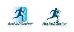
Here is a proposal with clothes, headphones and a phone to make it look like any jogger.
I changed the font.
Best regards -
Active2Gether says :
Dear Pegaze3000,
Thanks for the adjustments. Adding the clothes and phone plus earphones is a move in the right direction. However, we're still a bit concerned that the logo might be focused too much on ahtletics and sports. (It evokes associations to a Runkeeper-like application.) Our project is about supporting people to make active decisions in daily life, rather than supporting people to improve their athletic performance. We will still keep your design in mind, but we hope that you see our point.
Regards,
the Active2Gether team -
This contest is finished. Its not possible to reply anymore.
-
-
-
Active2Gether says :
Beste Pegaze3000,
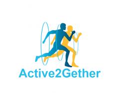
We vinden het vorige design mooier. We zijn geen grote fans van deze kleuren en de cirkels.
Groeten,
het Active2Gether team
===
Dear Pegaze3000,
We like the previous design better. We're no big fans of these colors and the circles.
Regards,
the Active2Gether team -
This contest is finished. Its not possible to reply anymore.
-
-
-
Description by designer Pegaze3000:
Hello,
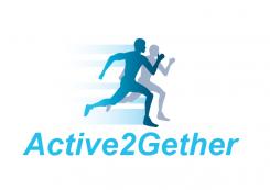
here are my proposals.
Regards -
Active2Gether says :
Beste Pegaze3000,
Bedankt voor je ontwerp. We vinden de rennende mannetjes er leuk uitzien. We willen alleen voorkomen dat het logo de indruk wekt dat ons project over atletiek gaat, aangezien de mannetjes er nogal atletisch uitzien. Zou je dat kunnen proberen aan te passen? Daarnaast geven we ook de voorkeur een iets interessanter lettertype. We zouden het ook leuk vinden om te zien hoe het eruit ziet als het mannetje een mobieltje in zijn hand heeft.
Groeten,
het Active2Gether team
===
Dear Pegaze3000,
Thank you for your design. We like the running men. However, we want to avoid that the logo gives the impression that our project is about athletics, as the men look quite athletic. Could you try to adjust that? Additionally, we would prefer a more interesting font. We're also curious to see what it looks like if the man is holding a phone in his hand.
Regards,
the Active2Gether team -
This contest is finished. Its not possible to reply anymore.
-


