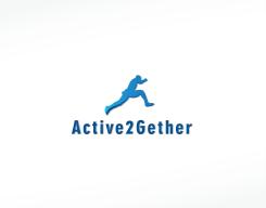
Logo for research project on physical activity!
Contest details:
Bronze
- Contest holder: Active2Gether
- Category: Logo design
- Total budget: € 199.00
- Start date : 22-08-2013 16:01
- Ending date : 22-09-2013 15:57
- Status : Ended
- Required formats: jpg,psd,ai,pdf,png,gif
- Relevant files: None
-
Available languages:


- Number of designs: 52
-
Response rate:
low high
Needs:
We're open to two kinds of logos:
(1) A logo that represents very clearly what our project is about: physical activity, young adults (18-25 yrs), social media, 'intelligent' system.
(2) A more abstract logo that represents what our project is about less explicitly, but that is appealing and recognizable.
We don't have a strong preference for either of the two types, but either way: we want something that looks nice (typo)graphically! Who'll make us happy?
Company description:
The research project Active2Gether is a collaboration between the department of Artificial Intelligence at the VU University in Amsterdam, the department of Biostatistics & Epidemiology at the VU Medical Center and Philips Research. Its objective is to design a system that motivates young adults (18-25 yrs) to be more physically active. The three key aspects of this system are: (1) physical activity, (2) influence of social networks and social media, and (3) innovation and intelligence.
Target group:
The logo is meant to provide the research project with a ‘face’ to the outside world. That means that the target audience is very broad, although it mainly consists of other researchers in related domains (Artificial Intelligence and Health Promotion). The logo could also be used in recruiting potential users of the system, so it should also appeal to young adults of 18 to 25 years old. Possibly, we will also use the logo for the system’s app in the iTunes app store and the Google Play store.
Colors, favourites and other requirements
The logos of all parties involved are predominantly blue, so it seems logical to show these colors in the logo of Active2Gether as well. However, this is no requirement: we are open to other suggestions and ideas. We prefer a modern and mature design, in which the focal points of the project are directly or indirectly recognizable: physical activity, social influences and innovation.
nele90
-
-
Active2Gether says :
Beste nele90,
Bedankt voor je ontwerp. We vinden de sprong van het poppetje een leuke variatie op het rennen, maar helaas spreekt de stijl van je ontwerp ons niet zo aan. (En het lijkt ook een beetje alsof hij een staartje heeft..?) Toch bedankt!
Groeten,
het Active2Gether team
===
Dear nele90,
Thank you for your design. We think that the jump is a nice twist on the running figure, but unfortunately, the style of your design does not really appeal to us. (And it looks a bit as if he has a tail..?) Thanks anyway!
Regards,
the Active2Gether team -
This contest is finished. Its not possible to reply anymore.
-

