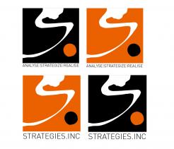
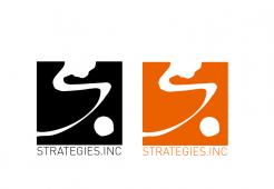
Logo for small strategy consulting firm
Contest details:
- Contest holder: Adri.Kraa@gmail.com
- Category: Logo design
- Total budget: € 100.00
- Start date : 23-08-2012 18:24
- Ending date : 06-09-2012 18:18
- Status : Ended
- Required formats: jpg,pdf,
- Relevant files: None
-
Available languages:


- Number of designs: 65
-
Response rate:
low high
Needs:
The name "STRATEGIES INC." should in a way be explained through the logo- as it signifies our views and approach on strategy consulting. Yes, the name is a bit of a (simple) wordplay for a strategy consulting firm, but the other thoughts behind it relate to the "INCORPORATED"; we help to create strategies that are "Combined, Joined and United into a Structured, Integrated and Coherent Whole" (according to the dictionary). See more on this company approach below...
Looking forward to your ideas!
Company description:
STRATEGIES INC. is an independent boutique consulting firm, advising (inter)national corporations and ambitious start-ups on their growth strategy creation, new business development and organisational transformation.
We believe in a Structured approach: First, harvesting deep external insights and Combining that with the company's real internal potential. Then, Jointly building holistic (Coherent) strategies from the discovered growth opportunities. Finally, Uniting and organising the company to realise the strategy and develop the business as a Whole.
Target group:
We (want to) work for both large multinationals as well as start-ups with international ambitions. Clients could come from various industries but with the common denominator of rapidly changing markets - giving our clients an opportunity and/or need to adapt to this.
STRATEGIES INC. can provide 3 types of service, written as: "Analyse - Strategize - Realise". This could be part of the logo, a subheader?
(as it also indicates our approach...)
Colors, favourites and other requirements
Not a direct preference for colours (although we like orange...) but the logo should not be too fancy or complex. It should come across on a business card and website.
The name STRATEGIES INC. should be there and possible our type of services as subtext: "Analyse - Strategize - Realise".
It should create trust through simplicity, clearness and the message it conveys. After all, it is about the content of our support - not the packaging..
jovanapsc
-
-
No comments
-
This contest is finished. Its not possible to reply anymore.
-
-
-
Adri.Kraa@gmail.com says :
Hi there,
Interesting design. Totally different from the others. But i like the visual of it (the right logo with the words in black and orange).
But..... we are looking for something that represents us and our unique idea and approach.
Can you explain your thoughts behind the design? What does it stand for - why?
Inspire us with the symbolism behind it that applies to us in Strategies inc.! -
jovanapsc says
Straight lines of the square represent strength and stability, which will isnpire confidence in customers. Stylish S, except first letter of the company name, it also represents skill and transformation, while dot represents determination which is important in any business. Whole logo represents company with skilled and capable workers and company that is able to provide best service to the customers and business sureness, which is necessary these days.
Black color represents elegancy, professionalism and seriousness, while orange color represents energy which is necessary for doing a good job and providing best service to the customers.
-
This contest is finished. Its not possible to reply anymore.
-


