Logo for small strategy consulting firm
Contest details:
- Contest holder: Adri.Kraa@gmail.com
- Category: Logo design
- Total budget: € 100.00
- Start date : 23-08-2012 18:24
- Ending date : 06-09-2012 18:18
- Status : Ended
- Required formats: jpg,pdf,
- Relevant files: None
-
Available languages:


- Number of designs: 65
-
Response rate:
low high
Needs:
The name "STRATEGIES INC." should in a way be explained through the logo- as it signifies our views and approach on strategy consulting. Yes, the name is a bit of a (simple) wordplay for a strategy consulting firm, but the other thoughts behind it relate to the "INCORPORATED"; we help to create strategies that are "Combined, Joined and United into a Structured, Integrated and Coherent Whole" (according to the dictionary). See more on this company approach below...
Looking forward to your ideas!
Company description:
STRATEGIES INC. is an independent boutique consulting firm, advising (inter)national corporations and ambitious start-ups on their growth strategy creation, new business development and organisational transformation.
We believe in a Structured approach: First, harvesting deep external insights and Combining that with the company's real internal potential. Then, Jointly building holistic (Coherent) strategies from the discovered growth opportunities. Finally, Uniting and organising the company to realise the strategy and develop the business as a Whole.
Target group:
We (want to) work for both large multinationals as well as start-ups with international ambitions. Clients could come from various industries but with the common denominator of rapidly changing markets - giving our clients an opportunity and/or need to adapt to this.
STRATEGIES INC. can provide 3 types of service, written as: "Analyse - Strategize - Realise". This could be part of the logo, a subheader?
(as it also indicates our approach...)
Colors, favourites and other requirements
Not a direct preference for colours (although we like orange...) but the logo should not be too fancy or complex. It should come across on a business card and website.
The name STRATEGIES INC. should be there and possible our type of services as subtext: "Analyse - Strategize - Realise".
It should create trust through simplicity, clearness and the message it conveys. After all, it is about the content of our support - not the packaging..
kc designing
-
-
Description by designer kc designing:
Beste Adri?
I want to show you my design for your company logo.
It is simple, classic , has a clean and professional look.
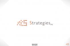
The parts combine into the letter S. I based this on the work you do for clients. You combine, join and unite into a structured whole. The logo does the same!
I am looking forward to your feedback.
Yours sincerely,
Ko-Lin -
Adri.Kraa@gmail.com says :
Hi Ko-Lin,
Thanks for this contribution. I am really happy that you think along with us, explain your thinking and that your design is based on our vision on strategy consulting. That makes it more specific to our little company. Great!
From a visual perspective I would like to see some further ideas. I Can see the letter S but can't make out what the little triangles on the right represent. Also why is the S of the full word in a different colour than the rest - is it more important or..? In that case would you not use the 'dotted S' as the first letter of the word Strategies?
Lastly, i don't think that the word "inc." should be smaller in size as then it could represent the legal from of our company (which it isn't). STRATEGIES INC.
(with the dot) is a name as a whole -
This contest is finished. Its not possible to reply anymore.
-

