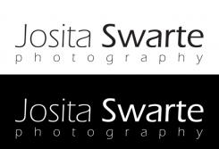
LOGO for starting photographer (minimal, graffic, typography based, hip)
Contest details:
- Contest holder: Josita
- Category: Logo design
- Total budget: € 100.00
- Start date : 05-08-2015 12:29
- Ending date : 22-08-2015 12:00
- Status : Ended
- Required formats: jpg,ai,pdf,
- Relevant files: None
-
Available languages:


- Number of designs: 76
-
Response rate:
low high
Needs:
Please design a hip, minimal, original, graffic, typography (I prefer thin lines) based logo for me as a starting photographer focussing on portraitphotography within the (amongst other) creative sector.
My website has a minimal, white look.
The logo will be used for my website, businesscards and most of all as a watermark on my photo's. As a watermark it's important that the logo is visible on lightcolored and darkcolored photo's.
Logo should be based on the following name: Josita Swarte Photography (my initials of my name may be used). Please see my website (not fully ready) to get an idea of the look of it.
I don't like pictures of camera's or lenzes etc in te logo as this is not so original anymore. Something graffic is ok.
Please find attached a graffic patern of my neckless that I would like to see included in my logo. I'm open for other similar graffic patterns. Subtle, thin lines fot the patern as well for the lettertype I prefer most.
Many thanks for your help!
Company description:
Target group:
Colors, favourites and other requirements
FinalFrontiers
-
-
Description by designer FinalFrontiers:
Hierbij tevens de losse logo's.
-
This contest is finished. Its not possible to reply anymore.
-
-
-
Description by designer FinalFrontiers:
Hoi Josita, de insteek van mijn ontwerp is 'houd het simpel'. Het logo is typografisch en zat te denken aan een beeldmerk dat je zou kunnen gebruiken in je foto's als watermerk. Dit zal minder afleiden dan het typografische logo, maar heeft hetzelfde doel. Uiteraard zijn varianten of verdere specifieke wensen omtrent het ontwerp uiteraard bespreekbaar. Groet, Jeroen
-
This contest is finished. Its not possible to reply anymore.
-


