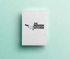
Logo for street food concept: The Rough Kitchen
Contest details:
Silver
- Contest holder: Marcus Polman
- Category: Logo design
- Total budget: € 329.00
- Start date : 11-09-2014 18:59
- Ending date : 29-09-2014 18:55
- Status : Ended
- Required formats: jpg,ai,pdf
- Relevant files: None
-
Available languages:


- Number of designs: 114
-
Response rate:
low high
Needs:
Key words: tough, rugged, robust, meat & fire, authenticity, butcher-lovers, from head to tail
Requirements:
* A logo with a powerful visual mark that expresses the essence of The Rough Kitchen
* Visual: Preferably not the clichés of pigs or cows (we also do other animals). Butcher tools again are possible but be creative, we are very much open to other creative images / visuals.
* Logo should be simple black / white and easy applicable in print. Also usable for napkins, textile etc. But also: lase metal.
* Logo is in addition used in other media outlets under the same label such as signing for the new position (s); The Rough Kitchen Magazine, The Rough Kitchen Cookbook, video / movies, and other media forms.
Company description:
THE ROUGH KITCHEN is a concept of two carnivores in Heart & Soul. We grill and roast and smoke. On great fires. We alove for cows and pigs. Preferably from head to tail. We make out of them superior homemade 100% Aberdeen Angus burger and steak sandwich from bavette. Or our well known 16 hours slow cooked pulled porc sandwich made from a pig from a nice backgrounds. From October 1, we have an indoor food stand on the new Food Halls Amsterdam.
The subtitle - by 'Smokey Goodness' and 'Vet Lekker'- refers to two partners with their own street food or catering concept who joined forces for this project under the new label The Rough Kitchen. See also: www.smokeygoodness and www.vetlekkerstreetfood.nl.
Target group:
Visitors to food festivals, men (but also women) , urban, food lovers, meat lovers
Colors, favourites and other requirements
Please as soon as possible, within one week because of start project.
Take a look at enclosed documents to get an understanding for our look and feel.
Verdickeme
-
-
Description by designer Verdickeme:
Het concept spreekt voor zich. Sterke typografische afwerking voor het gevoel van kracht en ruwheid, terwijl het toch "clean" blijft, iets dat bij de uitstraling van voedsel natuurlijk een hoge prioriteit heeft.
-
This contest is finished. Its not possible to reply anymore.
-

