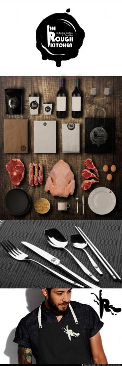
Logo for street food concept: The Rough Kitchen
Contest details:
Silver
- Contest holder: Marcus Polman
- Category: Logo design
- Total budget: € 329.00
- Start date : 11-09-2014 18:59
- Ending date : 29-09-2014 18:55
- Status : Ended
- Required formats: jpg,ai,pdf
- Relevant files: None
-
Available languages:


- Number of designs: 114
-
Response rate:
low high
Needs:
Key words: tough, rugged, robust, meat & fire, authenticity, butcher-lovers, from head to tail
Requirements:
* A logo with a powerful visual mark that expresses the essence of The Rough Kitchen
* Visual: Preferably not the clichés of pigs or cows (we also do other animals). Butcher tools again are possible but be creative, we are very much open to other creative images / visuals.
* Logo should be simple black / white and easy applicable in print. Also usable for napkins, textile etc. But also: lase metal.
* Logo is in addition used in other media outlets under the same label such as signing for the new position (s); The Rough Kitchen Magazine, The Rough Kitchen Cookbook, video / movies, and other media forms.
Company description:
THE ROUGH KITCHEN is a concept of two carnivores in Heart & Soul. We grill and roast and smoke. On great fires. We alove for cows and pigs. Preferably from head to tail. We make out of them superior homemade 100% Aberdeen Angus burger and steak sandwich from bavette. Or our well known 16 hours slow cooked pulled porc sandwich made from a pig from a nice backgrounds. From October 1, we have an indoor food stand on the new Food Halls Amsterdam.
The subtitle - by 'Smokey Goodness' and 'Vet Lekker'- refers to two partners with their own street food or catering concept who joined forces for this project under the new label The Rough Kitchen. See also: www.smokeygoodness and www.vetlekkerstreetfood.nl.
Target group:
Visitors to food festivals, men (but also women) , urban, food lovers, meat lovers
Colors, favourites and other requirements
Please as soon as possible, within one week because of start project.
Take a look at enclosed documents to get an understanding for our look and feel.
anweiwei
-
-
Description by designer anweiwei:
This is a simple design that will easy applicable in any use for the restaurant. It was based on a stamp seal but was made too seem a bit like blood. Depends on the viewer. On the R there is a knife stabing down for expressing a more powerful logo.
-
This contest is finished. Its not possible to reply anymore.
-

