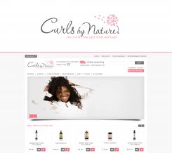
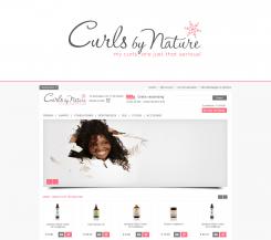
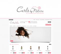
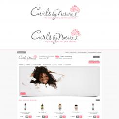
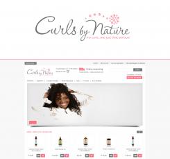
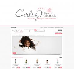
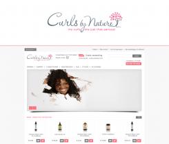
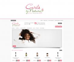
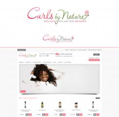
Logo for webshop in haircare products for people with curly, wavy and kinky hair
Contest details:
- Contest holder: missjj84
- Category: Logo design
- Total budget: € 135.00
- Start date : 10-02-2013 14:14
- Ending date : 28-02-2013 14:02
- Status : Ended
- Required formats: jpg,ai,pdf
- Relevant files: None
-
Available languages:


- Number of designs: 157
-
Response rate:
low high
Needs:
I'm looking for a logo for my webshop in products specific for people with curly, wavy and kinky hair. I once made a logo but it doesn't look professional. Please see: www.curlsbynature.com. Our slogan is: My curls...are just that serious! I prefer not seeing a figure in my logo.
Company description:
Target group:
Colors, favourites and other requirements
ON
-
-
missjj84 says :
I prefer the second one. Could you make one logo without the''..." in the slogan.
-
ON says
Sure...
-
This contest is finished. Its not possible to reply anymore.
-
-
-
No comments
-
This contest is finished. Its not possible to reply anymore.
-
-
-
missjj84 says :
What do you think looks best?
-
missjj84 says :
:-)
-
missjj84 says :
And how about the stripe of the 't'. Should it be straight or curly like the others?
-
ON says
I didn`t do it like the other ones, because it was getting too busy with the tree. But on top i fixed it by living a bit more space...I would say top 2 ones are the best looking ones..
-
ON says
I really like the tree because the trunk also looks like a person:)..But it is all up to you now, because a logo is at the very end a personal taste:)
-
missjj84 says :
Yes it;s very difficult. Im asking a couple of people now:-)
-
ON says
Yes that`s the best solution:).
-
ON says
Ah and if you decide on one of my logos, you have to give me the exact dimensions left for the logo on your website, so that i fix it and you don`t have to size it..
-
missjj84 says :
I had a question could you also provide PNG format with a transparant and white background?
-
ON says
sure..
-
missjj84 says :
Ok thank you for everything! a couple more days left:-)
-
ON says
Your welcome:)..
-
This contest is finished. Its not possible to reply anymore.
-
-
-
ON says
And here is the heart shape..
-
missjj84 says :
Thank you. Hmm Could you make a sun maybe. The sun make people happy:-)
-
ON says
Thanks for the ratings...I will try the sun:)
-
missjj84 says :
Could you also make the tree with the right 'y' :-)
-
ON says
Sure...
-
ON says
Personally heart shape and sun are not my favouratesI would eliminate those ones:)
-
ON says
Because when you give a specific shape like those, the elements becomes really small and you don`t have that much space on the website..
-
ON says
I hope i am helping you and not confusing you more:)
-
missjj84 says :
Yes they're not my favorites either. How about the slogan of the tree. shouldn't it be aligned to the right more? So the slogan ends at the tree.
-
ON says
Both tree examples that i did might be done with the slogan...
-
This contest is finished. Its not possible to reply anymore.
-
-
-
No comments
-
This contest is finished. Its not possible to reply anymore.
-
-
-
missjj84 says :
Thanks. I don't really like the ''e'' . Hmm how about a heart?
-
missjj84 says :
A heart as in like your curls..
-
missjj84 says :
I mean love your curls
-
This contest is finished. Its not possible to reply anymore.
-
-
-
Description by designer ON:
What about the star or sea star idea?:)
-
missjj84 says :
Hmm im not sure about the star. Perhaps you can make it just round.
-
missjj84 says :
I do like the place where you put the element.
-
ON says
Somehow we will find the best solution:))
-
missjj84 says :
Actually the star has something:-) It's so difficult
-
ON says
I like the star, it has the idea of `shining` for hair and it is also some natural element..
-
ON says
Believe me i know very well that it is difficult to make a decision. But take your time and look again and again. You should love your logo whenever you look:)
-
This contest is finished. Its not possible to reply anymore.
-
-
-
ON says
I did both for you to decide better.
-
missjj84 says :
Thank you! I think the round element looks better in general on the website. I don't know if you have more inspiration to do some other type of curls elements:-)
-
missjj84 says :
I think the grey is too dark. It doesn't look like the other lettertypes. Or maybe it's just me. I will contact my webmaster tomorrow.
-
ON says
Hmm, this is the gray you told me... I can try other curl elements, but singular curl shapes make me remember of party, events for kids kinda logos:)..
-
missjj84 says :
It's not that I don't like this one. Because I like this one a lot. I just to make a comparison and to make a final decision.
-
ON says
Sure, i understand you. Actually i have another idea, working on it now:)
-
missjj84 says :
Thank you so much!
-
This contest is finished. Its not possible to reply anymore.
-
-
-
ON says
I am gonna play a bit with the slogan here, i am not yet 100% happy with it:)
-
ON says
Ah and i corrected the colours..
-
missjj84 says :
ok thank you!
-
missjj84 says :
Im sorry again:-) If you make an other version with the slogan and the tree could you please make that exact version but with the other curl element. Because i think the overall look of the logo in the webshop looks better with the round element. I do like the tree but for the overall look ín the webshop it looks better without the tree.
-
This contest is finished. Its not possible to reply anymore.
-
-
-
missjj84 says :
#5c5c5c grey pink:#fd6a7b
-
ON says
Here we go...My concern about this version is the size of the slogan... To try to fit it there makes the writing too small..But don`t worry there are always other solutions (to play with the letter Y for ex)
-
ON says
ok. thanks..
-
missjj84 says :
I just post you the numbers of the colours. Hmmm im so sorry could you put the tree back. So i can make a comparison. Maybe I prefer the tree better:-) I think the slogan is too small right? Maybe you could make the letters a little bit bigger.
-
missjj84 says :
ok thanks!
-
missjj84 says :
Im sorry I think I go for the tree. The tree element says a lot for example about the products(natural products with natural ingredients in it) It also looks like a afro. and it's a website for people with natural curly hair. I do like it actually.
-
ON says
Also the leaves of the tree are like the hair of the tree:) And about the slogan i wouldn`t squeeze it after the Y, it becomes too small..
-
ON says
If i make the letters bigger than the dimensions have to change...Because for a better look the slogan has to end where the word Nature ends..
-
missjj84 says :
Ok could you make your version what looks best
-
This contest is finished. Its not possible to reply anymore.
-
-
-
ON says
I tried to catch the exact pink but to be able to have the same i need the Hex Codes of the gray and the pink. This pink is Pantone 191C.
-
missjj84 says :
Thank you! I like this element better than the tree. Im not sure about the slogan. Maybe it should begin after the ''y''. Could you make a version of that that used to see. I will contact my webmaster for the colour.
-
ON says
Thanks for the rating and I will deal with the slogan. I also need the exact pixel dimensions left for the logo on the left side...
-
missjj84 says :
Im sorry I mean could you make a version with the slogan starting after te ''y'' sothat I can see how that looks.
-
ON says
Sure, i can make...
-
This contest is finished. Its not possible to reply anymore.
-
-
-
ON says
I changed the flower but i prefer to stay in the `nature` concept of your brand and combine the curls with some element from nature..
-
missjj84 says :
Thank you for the logo. Could you make the red colour pink like the pink in the website. Perhaps you could make one big curls on top of the tree just the see how that looks.
-
ON says
Sure, could you tell me the HEX code (it is the colour code) of the pink on the website?
-
This contest is finished. Its not possible to reply anymore.
-
-
-
ON says
Here is the vertical version of the logo.
-
missjj84 says :
I prefer the horizontal look. I think it looks better.
-
This contest is finished. Its not possible to reply anymore.
-
-
-
Description by designer ON:
Dear Curls by Nature Team,
Here is the logo I have come up with for you. The font is customized, also clearly readable...Please let me know if this is heading in the right direction and if there is anything you would like me to tweak in the logo, i.e. fonts, colours, image etc. Please feel free to let me know and I’ll see what I can do :)
Best Regards, ON -
missjj84 says :
Thank you for the logo. I do like the signature look. The flower i don't like. Maybe you could make a curl instead of a flower. And the colours i don't really like. Could you make the logo grey and the slogan pink. So i can see if I like it. Thank you.
-
This contest is finished. Its not possible to reply anymore.
-

