Logo / lettering for a new bike brand (Pedelec/ebike)
Contest details:
Silver
- Contest holder: 77z
- Category: Logo design
- Total budget: € 299.00
- Start date : 18-01-2013 15:23
- Ending date : 01-02-2013 15:21
- Status : Ended
- Required formats: jpg,ai,pdf
- Relevant files: None
-
Available languages:


- Number of designs: 113
-
Response rate:
low high
Needs:
We need a seperate logo and lettering.
logo suggestions/ideas: Initial letter, bicycle-, resp. pedelecspesific components, could be kind of a emblem/crest, should be good presentable on the head tube, lettering does not have to covered to the logo. for example: www.tommasini.it
Lettering: In the style of classic, italian bike brands, precious, subtle, professional, also would like old fonts.
Company description:
We are a small bike manufacture which is focused on the construction of classic steel frame bikes. The bikes are optical based on the style of "Fixie" Singlespeed bikes.
Target group:
- young, urban bikers
- individualists
- 20-45
Colors, favourites and other requirements
No restrictions !
Mooiniet
-
-
Description by designer Mooiniet:
Hi Frank,
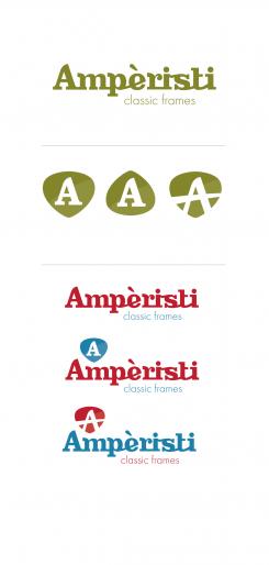
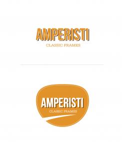
Thanks for your reaction! I altered my proposal to have a capitol, with matching emblem. I can understand choosing is difficult! From a designer viewpoint I would say that the ones you gave most stars are all good quality choices. Just think what matches you company best. Mine seem to be somewhat more retro than the others, they seem to have more of a smooth effect in lettering, which is more modern. My last proposal has thicker lettering, so that might be more readible on a frame. There's something to say for them all. So good luck and if there's anythink I can do, let me know!
Regards,
Jo - mooiniet -
This contest is finished. Its not possible to reply anymore.
-
-
-
77z says :
Hi Jo, we like both. Now it is getting heavier for us. At the first impression we preferred the logos with the letter inside. Not sure if small or capitol will be the first choice.
-
This contest is finished. Its not possible to reply anymore.
-
-
-
Description by designer Mooiniet:
Hi Frank,
Thank you for the positive feedback!
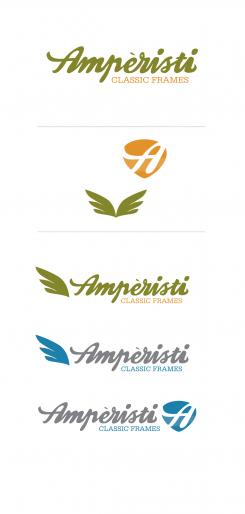
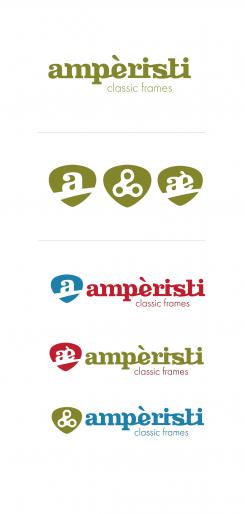
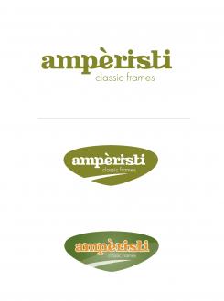
Hereby some altered proposals, with a seperate emblem. I tried a few different things, like the 'A' or 'AE', a more contructive symbol and speedy wing. I also varied a bit with the colours.
Well, let me know if there's anything you like or changes I should make.
Regards,
Jo-mooiniet -
This contest is finished. Its not possible to reply anymore.
-
-
-
77z says :
Hey Mooinet, that kind of hand written letter looks really good. When I look at the first designs I think that my description wasn't precise enough. We need the complete brand name like you can see it on almost every bike frame. For the head tube it should be more like a sign. For example take a sprocket and put the A from Ampèristi the brand in it.
I will edit the requirement accordingly.
Cheers
Frank -
This contest is finished. Its not possible to reply anymore.
-
-
-
No comments
-
This contest is finished. Its not possible to reply anymore.
-
-
-
Description by designer Mooiniet:
Hello 77z,
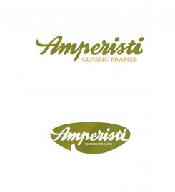
Hereby three proposals for a logo. I felt inspired, I love retro. The first one is the strongest, with a somewhat retro letter that is still modern and used a lot today.
The second one works best in the crest.
The third is inspired by really old, handwritten logo's, that always look as though they are a bit off.
I placed them all in a crest with a vintage/kidenlike shape. I am not sure however if this is usable or convenient on the head tube.
Please let me know if there is a proposal that you like. Ik can always make alterations or variations.
Best regards,
Jo - mooiniet -
This contest is finished. Its not possible to reply anymore.
-

