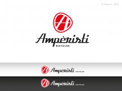
Logo / lettering for a new bike brand (Pedelec/ebike)
Contest details:
Silver
- Contest holder: 77z
- Category: Logo design
- Total budget: € 299.00
- Start date : 18-01-2013 15:23
- Ending date : 01-02-2013 15:21
- Status : Ended
- Required formats: jpg,ai,pdf
- Relevant files: None
-
Available languages:


- Number of designs: 113
-
Response rate:
low high
Needs:
We need a seperate logo and lettering.
logo suggestions/ideas: Initial letter, bicycle-, resp. pedelecspesific components, could be kind of a emblem/crest, should be good presentable on the head tube, lettering does not have to covered to the logo. for example: www.tommasini.it
Lettering: In the style of classic, italian bike brands, precious, subtle, professional, also would like old fonts.
Company description:
We are a small bike manufacture which is focused on the construction of classic steel frame bikes. The bikes are optical based on the style of "Fixie" Singlespeed bikes.
Target group:
- young, urban bikers
- individualists
- 20-45
Colors, favourites and other requirements
No restrictions !
7 Men
-
-
No comments
-
This contest is finished. Its not possible to reply anymore.
-
-
-
Description by designer 7 Men:
Ok Frank,
Final shot!
Best regards,
7 Men -
This contest is finished. Its not possible to reply anymore.
-
-
-
Description by designer 7 Men:
And herewith a more active logo.
-
This contest is finished. Its not possible to reply anymore.
-
-
-
Description by designer 7 Men:
Hello Frank,
Thank you. Still figuring out to get that 5 star ranking ;)
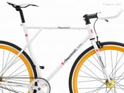
Herewith a more solid frame.
Best regards,
7 Men -
This contest is finished. Its not possible to reply anymore.
-
-
-
Description by designer 7 Men:
Like this?
-
77z says :
good job :) where getting close
-
This contest is finished. Its not possible to reply anymore.
-
-
-
Description by designer 7 Men:
A simplification of the first concept... more powerful, easier in use!
-
77z says :
We like the first one with the white frame better, because we could use just the white lines to get a clean logo. but the form of this logo is better. so a mix of the first one and this one would be great.
-
This contest is finished. Its not possible to reply anymore.
-
-
-
Description by designer 7 Men:
Hello Frank,
Herewith another idea. -
This contest is finished. Its not possible to reply anymore.
-
-
-
No comments
-
This contest is finished. Its not possible to reply anymore.
-
-
-
Description by designer 7 Men:
Hello Frank,
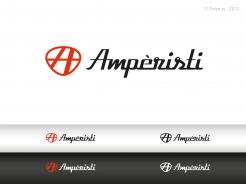
Herewith my samples of your new logo.
Looking forward to hearing from you!
Best regards,
7 Men -
77z says :
Hello 7 Men, your samples looks really good. We love the letters. We have to think about the logo and will come back with another comment..
Thanks so far
Frank -
This contest is finished. Its not possible to reply anymore.
-

