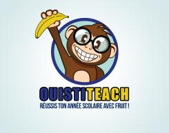
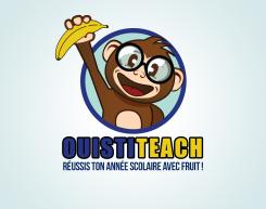
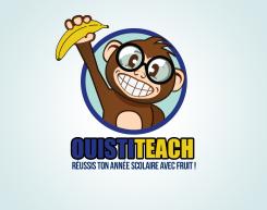
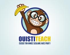
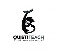
LOGO of a MONKEY who proudly holds a BANANA
Contest details:
Silver
- Contest holder: Big Ben Junior
- Category: Logo design
- Total budget: € 329.00
- Start date : 10-08-2015 16:31
- Ending date : 31-08-2015 16:21
- Status : Ended
- Required formats: psd,ai,png,ps/eps,svg,pdf
- Relevant files: None
-
Available languages:


- Number of designs: 139
-
Response rate:
low high
Needs:
I invite you warmly to participate in the creation of the logo of a future website called Ouistiteach (Ouistiti is the french name for the monkey called Marmoset).
The website will be dedicated to the academic success of students 12 to 18 years-old. It will offer videos and exercises aimed at correcting deficiencies of students in different school subjects.
The logo will be used primarily on a banner published on every page of our website, as well as on each of our videos. It will also be included on our pdf, sheets of paper, contact letters, business cards, flyers and posters.
The logo is made up of three elements:
1) A monkey proudly brandishing a banana in the air. Imagine a hungry baby monkey lost in the jungle who just found his first banana. * * The monkey must take this banana in one hand. The monkey must seems to be intelligent, for example by wearing big glasses (it's cliche, but effective, but if you have other ideas you pleasure), but mostly not toga (this reference incidental to the world of universities, this is for children 12 to 18 years). The monkey must look like very friendly and proud to have found his banana. The monkey must be a Marmoset, ie small cute innocent and kind (check out google images). The monkey must be charismatic, he must not looks like any other monkey, originality is key to stand out from the competition. Finally, despite its intelligent side, the monkey must have a funny aspect, that can be in the way he stands or in his facial expression, he must makes me smile :) You are free to decide to represent only his head with his hand holding banana or his entire body, but keep in mind that I want a relatively simple logo, don't make a too great or too sophisticated monkey.
2) The company name: Ouistiteach. I think it would be wise to write "Ouisti" of a certain color and "teach" a different color, but you see the result, maybe it is not a good idea, its up to you, you are the artist :)
3) The slogan: Réussis ton année scolaire avec fruit ! (Do not forget the exclamation mark and the space between fruit and !).
The idea is to have a simple logo (no unnecessary sophistication) that manages to convince students of the playful nature of the website to make people want to learn on our website.
The logo must be in vector format so it can be resized at will without loss of quality, thank you!
Company description:
Ouistiteach's objective is to accompany the students 12 to 18 years in academic success. To this end, theoretical and practical exercises videos will be proposed in subjects ranging from mathematics to the French-language education.
Target group:
Young people aged 12 to 18 attending school in Belgium.
Thus, the logo should not be considered too childlike by teenagers of 18, but not be considered too seriously by children of 12 ... good luck!
Colors, favourites and other requirements
The website does not yet have a graphic, it will be decided based on the colors of your logo. Feel free to provide the color scheme that you consider appropriate. However, please keep in mind that the logo should be simple. In that sense I do not think it is appropriate to provide more than 3 different colors, but feel free to go overseas this indication if you deem it necessary, after all you are the professionals.
Voila, I wish you a good job. Your logo is the first stone laid in the building of the future company, do your best, thank you ! :)
Abyss27
-
-
Description by designer Abyss27:
Oh and ive made with one with some teeth again, but these are more angular. Which should get rid of that tense feeling.
-
This contest is finished. Its not possible to reply anymore.
-
-
-
Description by designer Abyss27:
Hi thank you for your feedback. I actually quite liked the big smile, and you mentioned you liked it too. I think it gives him some character and makes him stand out. But anyway, I gave him a different more normal looking mouth. Still a big smile though.
-
This contest is finished. Its not possible to reply anymore.
-
-
-
Description by designer Abyss27:
Here you go.
-
Big Ben Junior says :
Thank you for your work ! Because of the outline now the letters are too close to one another. Could you add an espace between letters like in the previous proposal ? I also have an other problem with your logo. I've introduced it to my friends and they have a mixed feeling about it because of its smile. Could you present me the same logo and the same monkey but with a totaly different smile ? An happy smile which gives to the monkey a funny expression but without all these tooths which give to the monkey a tense expression. Thank you ! :)
-
This contest is finished. Its not possible to reply anymore.
-
-
-
Description by designer Abyss27:
Here are the adjustments. See it in full view if you click on the image.
-
Big Ben Junior says :
Awesome, good job ! Could you also add a black outline to the brand name ? And fix the typo error in the slogan (Réussis, you forgot the 'R'). Thank you !
-
This contest is finished. Its not possible to reply anymore.
-
-
-
Description by designer Abyss27:
A different option.
-
Big Ben Junior says :
Thanks but I prefere the first vesion with the circle.
-
This contest is finished. Its not possible to reply anymore.
-
-
-
Description by designer Abyss27:
So I decided to start with a new design again. A new monkey. Hopefully is getting closer to what you are looking for. Ive kept the big smile. Added some glasses but changed the design and color.
-
Big Ben Junior says :
Thanks, I really like this version. Your monkey is cute, funny, intelligent and original, good job ! However I have some suggestions in order to improve it. I don't like the angular-shape of his arm, can you rework on it ? The banana is blurred and lacks of finish touch. Also, could you write "Ouisti" in blue (the blue use for the outline of the cercle) and "teach" in yellow (the yellow used for the banana). I would like to avoid this orange color. Thank you :)
-
This contest is finished. Its not possible to reply anymore.
-
-
-
Description by designer Abyss27:
And here is completely different monkey. A little slimmer and looks a bit more like a student monkey.
-
Big Ben Junior says :
I dont like very the color of your monkey. Also your monkey has a sad expression because of the eyebrow on the right. I prefere the big smile version !
-
This contest is finished. Its not possible to reply anymore.
-
-
-
Description by designer Abyss27:
Heres number two.. a slighty different look.
With some glasses -
Big Ben Junior says :
I dont like this color scheme and I prefere the originality of the previous version. I invite you to work on the improvement of the previous monkey.
-
This contest is finished. Its not possible to reply anymore.
-
-
-
Description by designer Abyss27:
Hello, so I've been working on the monkey. In fact I've been working so hard on these monkeys.. Im starting to hate monkeys.. But that's a different story. So Im about upload a few designs.. Two different styled monkeys.
-
Big Ben Junior says :
Thank you for your incredible work ! This version is my favorite, I like his big smile :D I hope you have still energy and dynamism to work on it, because I need you to improve it ! First I dont like this green outline. Could you replace it by a black color, or simply remove this outline ? Second I would like you to add an accessory to the monkey to give him an intelligent appearance, for example big eyeglasses. Also, fix the name of the brand, it is "Ouistiteach". Good luck, your logo has a lot of potential :)
-
This contest is finished. Its not possible to reply anymore.
-
-
-
Description by designer Abyss27:
Hi, this is my first proposal. If you like the design I could present a few options with different color schemes.
You can click on the image to see it in full view -
Big Ben Junior says :
Hello Abyss27, thank you for your work ! I really like the design style of your monkey, he seems in very good shape :) I invite you to show me a few options with different color schemes to get a better idea of the potential of your logo. However I have 2 recommandations for you to improve it. First, your monkey seems a little bit sad, anxious, idk maybe it is because of the eyebrow. Can you make him more happy, enjoying live with his banana ? The other remak concerns the dimension of the monkey. I need a more balanced proportion between lenght and width. Can you fix that ? Thank you, good luck !!
-
This contest is finished. Its not possible to reply anymore.
-

