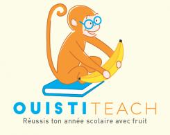
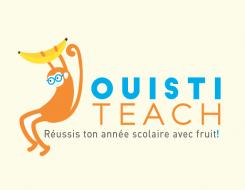
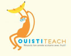
LOGO of a MONKEY who proudly holds a BANANA
Contest details:
Silver
- Contest holder: Big Ben Junior
- Category: Logo design
- Total budget: € 329.00
- Start date : 10-08-2015 16:31
- Ending date : 31-08-2015 16:21
- Status : Ended
- Required formats: psd,ai,png,ps/eps,svg,pdf
- Relevant files: None
-
Available languages:


- Number of designs: 139
-
Response rate:
low high
Needs:
I invite you warmly to participate in the creation of the logo of a future website called Ouistiteach (Ouistiti is the french name for the monkey called Marmoset).
The website will be dedicated to the academic success of students 12 to 18 years-old. It will offer videos and exercises aimed at correcting deficiencies of students in different school subjects.
The logo will be used primarily on a banner published on every page of our website, as well as on each of our videos. It will also be included on our pdf, sheets of paper, contact letters, business cards, flyers and posters.
The logo is made up of three elements:
1) A monkey proudly brandishing a banana in the air. Imagine a hungry baby monkey lost in the jungle who just found his first banana. * * The monkey must take this banana in one hand. The monkey must seems to be intelligent, for example by wearing big glasses (it's cliche, but effective, but if you have other ideas you pleasure), but mostly not toga (this reference incidental to the world of universities, this is for children 12 to 18 years). The monkey must look like very friendly and proud to have found his banana. The monkey must be a Marmoset, ie small cute innocent and kind (check out google images). The monkey must be charismatic, he must not looks like any other monkey, originality is key to stand out from the competition. Finally, despite its intelligent side, the monkey must have a funny aspect, that can be in the way he stands or in his facial expression, he must makes me smile :) You are free to decide to represent only his head with his hand holding banana or his entire body, but keep in mind that I want a relatively simple logo, don't make a too great or too sophisticated monkey.
2) The company name: Ouistiteach. I think it would be wise to write "Ouisti" of a certain color and "teach" a different color, but you see the result, maybe it is not a good idea, its up to you, you are the artist :)
3) The slogan: Réussis ton année scolaire avec fruit ! (Do not forget the exclamation mark and the space between fruit and !).
The idea is to have a simple logo (no unnecessary sophistication) that manages to convince students of the playful nature of the website to make people want to learn on our website.
The logo must be in vector format so it can be resized at will without loss of quality, thank you!
Company description:
Ouistiteach's objective is to accompany the students 12 to 18 years in academic success. To this end, theoretical and practical exercises videos will be proposed in subjects ranging from mathematics to the French-language education.
Target group:
Young people aged 12 to 18 attending school in Belgium.
Thus, the logo should not be considered too childlike by teenagers of 18, but not be considered too seriously by children of 12 ... good luck!
Colors, favourites and other requirements
The website does not yet have a graphic, it will be decided based on the colors of your logo. Feel free to provide the color scheme that you consider appropriate. However, please keep in mind that the logo should be simple. In that sense I do not think it is appropriate to provide more than 3 different colors, but feel free to go overseas this indication if you deem it necessary, after all you are the professionals.
Voila, I wish you a good job. Your logo is the first stone laid in the building of the future company, do your best, thank you ! :)
mariagd
-
-
Big Ben Junior says :
Mêmes remarques ici, votre singe est trop grand, j'ai besoin d'un logo plus simple. Aussi votre singe ressemble à un enfant avec une queue, j'aimerais un véritable singe, et que vous abandonniez cette couleur orange, bonne chance !
-
This contest is finished. Its not possible to reply anymore.
-
-
-
Big Ben Junior says :
Merci pour vos nouvelles contributions ! Celle-ci est mieux mais je trouve le logo toujours trop "massif". Votre singe est vraiment encombrant, le tout manque de simplicité. J'aime beaucoup la posture de votre singe mais je pense qu'il faudrait revoir le reste. Tout d'abord je ne suis pas fan de la couleur orange, j'aimerais l'éviter pour une couleur qui se rapprocherait plus de celle du singe. En fait si on coupait la queue de votre singe, je pense qu'on aurait du mal à imaginer qu'il s'agit d'un singe. J'aimerais un singe plus caractéristique, que cela saute aux yeux. Je vous invite donc à refaire un singe en gardant l'idée de la posture, mais en lui donnant une couleur et des caractéristiques physiques qui permettent de l'identifier comme singe du premier coup d'oeil. Merci et bon courage ((:
-
This contest is finished. Its not possible to reply anymore.
-
-
-
Big Ben Junior says :
Merci pour votre travail Maria ! J'aime beaucoup l'originalité de votre logo, votre singe me fait rire (: cependant j'ai un soucis majeur avec votre singe... il est bien trop grand. J'ai besoin d'un singe plus petit afin qu'il puisse plus facilement être utilisé sur nos différents supports. Aussi votre singe a du ventre, ça donne l'impression que votre singe se laisse aller et se goinfre de bananes toute la journée, ce n'est pas en adéquation avec l'esprit de notre entreprise étant donné que nous souhaitons encourager les élèves à se reprendre en main. Je vous invite donc à retravailler votre logo en tenant compte de ces remarques, bonne chance !
-
mariagd says
Merci beaucoup pour votre avis! je vais travailler sur ça (:
-
This contest is finished. Its not possible to reply anymore.
-


