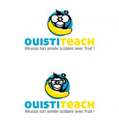
LOGO of a MONKEY who proudly holds a BANANA
Contest details:
Silver
- Contest holder: Big Ben Junior
- Category: Logo design
- Total budget: € 329.00
- Start date : 10-08-2015 16:31
- Ending date : 31-08-2015 16:21
- Status : Ended
- Required formats: psd,ai,png,ps/eps,svg,pdf
- Relevant files: None
-
Available languages:


- Number of designs: 139
-
Response rate:
low high
Needs:
I invite you warmly to participate in the creation of the logo of a future website called Ouistiteach (Ouistiti is the french name for the monkey called Marmoset).
The website will be dedicated to the academic success of students 12 to 18 years-old. It will offer videos and exercises aimed at correcting deficiencies of students in different school subjects.
The logo will be used primarily on a banner published on every page of our website, as well as on each of our videos. It will also be included on our pdf, sheets of paper, contact letters, business cards, flyers and posters.
The logo is made up of three elements:
1) A monkey proudly brandishing a banana in the air. Imagine a hungry baby monkey lost in the jungle who just found his first banana. * * The monkey must take this banana in one hand. The monkey must seems to be intelligent, for example by wearing big glasses (it's cliche, but effective, but if you have other ideas you pleasure), but mostly not toga (this reference incidental to the world of universities, this is for children 12 to 18 years). The monkey must look like very friendly and proud to have found his banana. The monkey must be a Marmoset, ie small cute innocent and kind (check out google images). The monkey must be charismatic, he must not looks like any other monkey, originality is key to stand out from the competition. Finally, despite its intelligent side, the monkey must have a funny aspect, that can be in the way he stands or in his facial expression, he must makes me smile :) You are free to decide to represent only his head with his hand holding banana or his entire body, but keep in mind that I want a relatively simple logo, don't make a too great or too sophisticated monkey.
2) The company name: Ouistiteach. I think it would be wise to write "Ouisti" of a certain color and "teach" a different color, but you see the result, maybe it is not a good idea, its up to you, you are the artist :)
3) The slogan: Réussis ton année scolaire avec fruit ! (Do not forget the exclamation mark and the space between fruit and !).
The idea is to have a simple logo (no unnecessary sophistication) that manages to convince students of the playful nature of the website to make people want to learn on our website.
The logo must be in vector format so it can be resized at will without loss of quality, thank you!
Company description:
Ouistiteach's objective is to accompany the students 12 to 18 years in academic success. To this end, theoretical and practical exercises videos will be proposed in subjects ranging from mathematics to the French-language education.
Target group:
Young people aged 12 to 18 attending school in Belgium.
Thus, the logo should not be considered too childlike by teenagers of 18, but not be considered too seriously by children of 12 ... good luck!
Colors, favourites and other requirements
The website does not yet have a graphic, it will be decided based on the colors of your logo. Feel free to provide the color scheme that you consider appropriate. However, please keep in mind that the logo should be simple. In that sense I do not think it is appropriate to provide more than 3 different colors, but feel free to go overseas this indication if you deem it necessary, after all you are the professionals.
Voila, I wish you a good job. Your logo is the first stone laid in the building of the future company, do your best, thank you ! :)
freebird
-
-
Big Ben Junior says :
Perfect, thank you ! :)
-
Big Ben Junior says :
Could you also give me a version with only the cercle and the monkey (without the name brand and slogan) in order to be able to use my logo without typography ? Thanks !
-
This contest is finished. Its not possible to reply anymore.
-
-
-
Big Ben Junior says :
:)
-
This contest is finished. Its not possible to reply anymore.
-
-
-
Description by designer freebird:
thanks again for your feedback! I think that this could be a good compromise.
-
Big Ben Junior says :
YES, very nice, I like the first one ! I have one last request :) Can you fix his mouth ? It is too high and wide compared to the classic version. Also, could you lower the slogan in relation to the brand name on the second picture ? I want to see the result with a white space between name and slogan, thanks !
-
This contest is finished. Its not possible to reply anymore.
-
-
-
Description by designer freebird:
Hi!
I made 3 variations on the outline, I think the one on the bottom connects the monkey more with the name, Don't know if you like that, of course it's all a matter of taste :)
-
Big Ben Junior says :
grrrrr I like the 3 of them, it's hard to choose !! So it's a good point for you, good work !
-
Big Ben Junior says :
I think I prefere the first one as concerning the third one I dont like very much the white outline around his haircut and his tail, but I understand it's inevitable as the outline of the cercle is black.
-
This contest is finished. Its not possible to reply anymore.
-
-
-
Description by designer freebird:
Thanks again for your feedback, I added an outline on the name.
Sincerely,
Jeroen Kraneveld
Freebirds Grafisch Ontwerp -
Big Ben Junior says :
Great work ! Thank you :) I dont see any way possible to improve it more. This is what i am looking for : a small monkey cute, intelligent, funny and charismatic, well done. However the contest is not over, your monkey is not the only one I like. I invite you to make me new proposals if you have still time in order to increase your chances of success ;)
-
Big Ben Junior says :
Wait, I have still a small problem with it, sorry !! ;) I don't think it's fair that the name of the brand is more emphasized that the monkey-logo itselft. I invite you to show me 2 new version :
- The first one with a light outline for the blue circle and a little bit less emphasized outline for the name ?
- The second one, don't add an outline at the blue circle, but just reduce a little bit the emphasized outline for the name.
Thanks ! -
Big Ben Junior says :
dont take into consideration my question mark, it is a typing error
-
This contest is finished. Its not possible to reply anymore.
-
-
-
Description by designer freebird:
Thank you very much for your positive feedback! I've changed a few things, if you have any suggestions please let me know!
Sincerely,
Jeroen Kraneveld
Freebirds Grafisch Ontwerp -
Big Ben Junior says :
ahahah, your monkey is so sweeeet with his big glasses !! :D He has charisma, personality, he makes me laugh, I like it ! Ok, very good work Mr Jeroen. Concerning the font, could you please add a black border to Ouistiteach please ? I would like to see the result, the name should be more emphasized, thank you !
-
This contest is finished. Its not possible to reply anymore.
-
-
-
Big Ben Junior says :
Thank you for your work freebird. I like the way the logo looks like, good work ! I like colors, blue and yellow are perfect together. The logo is simple as I requested. The monkey is cute and looks like intelligent, and he has a BIG BANANA ! However, you could improve your work by showing me different fonts for the name and the slogan. I dont like the font used for the name because the letters are too thin. I think that for the name, the characters should be a little bit more thick. Also, can you show me an exemple with "ouisti" in blue and "teach" in yellow please ? Concerning the slogan, I dont like the font because it takes efforts to read. I hope you will be able to improve these points, thank you ! Oh, and if you can show me an other version of the logo by replacing the squares glasses with big round glasses which looks nerd, I would love to see the results :)
-
This contest is finished. Its not possible to reply anymore.
-


