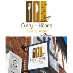
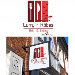
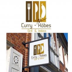
Logo Re - Design / Makeover / New design for a new restaurant concept
Contest details:
Bronze
- Contest holder: metzgerei27
- Category: Logo design
- Total budget: € 229.00
- Start date : 19-09-2014 17:53
- Ending date : 13-10-2014 17:50
- Status : Ended
- Required formats: jpg,psd,ai,pdf
- Relevant files: None
-
Available languages:


- Number of designs: 130
-
Response rate:
low high
Needs:
The traditional logo of our butcher shop contains a figure , our so -called " Köbes " - not to be confused with the Cologne waiter - we could imagine to name the new concept : Curry Köbes .
Our idea was to take that " Köbes " figure out of our ' old 'Logo ( mainly due to back recognizability reasons) and give it a modern up-to-date look. However, we are open to better suggestions !
- Modern and hip , yet serious logo that may like to represent an absolute break in style to our other business
- " Loud " and " delicious - hungry -making " broadcast
- Use as a word / figurative mark
- Manhattan - gray and red are the colors represented for mainly in the business , but also may quite possibly be a break in style , in the interest of better differentiation from other business
further information about us , please visit our website www.metzgerei27.de (which also requires a revision on occasion.
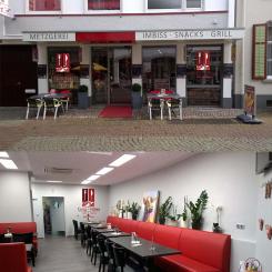
Photos of the facade and interiors can be requested by email.
Company description:
Target group:
Colors, favourites and other requirements
PubliDesign
-
-
Description by designer PubliDesign:
Hi,
Here's another design... -
metzgerei27 says :
not bad either, however I did like your other entries better
-
This contest is finished. Its not possible to reply anymore.
-
-
-
No comments
-
This contest is finished. Its not possible to reply anymore.
-
-
-
Description by designer PubliDesign:
Well, i've done 2 different ones... one with and one without shadow behind the white fork, knife and logo :)
-
metzgerei27 says :
at this point, definetly within the top 5
-
This contest is finished. Its not possible to reply anymore.
-
-
-
Description by designer PubliDesign:
Like this ? :)
Kind regards...
Oliver -
metzgerei27 says :
well, I'd say make it all white, forget about the checked pattern on the apron, the arms, shirt, plate and so on, no red details whatsoever; just all plain white
-
This contest is finished. Its not possible to reply anymore.
-
-
-
metzgerei27 says :
what if... we would just silhoutte the Köbes guy...? that might be worth a shot
-
metzgerei27 says :
so that you basically just got the köbes outline, forget about the inner details... white fork, white knife, white köbes silhoutte
-
This contest is finished. Its not possible to reply anymore.
-
-
-
Description by designer PubliDesign:
And another variation... :)
Kind regards
Oliver -
This contest is finished. Its not possible to reply anymore.
-
-
-
Description by designer PubliDesign:
And one with all images rotated 90°
-
This contest is finished. Its not possible to reply anymore.
-
-
-
Description by designer PubliDesign:
Here's one with the köbes figure rotated 90°
and the Moeselaegen logo bigger. -
This contest is finished. Its not possible to reply anymore.
-
-
-
Description by designer PubliDesign:
Hi,
Here's one with the requested changes.
Hope you like it.
Kind regards,
Oliver -
metzgerei27 says :
lovely, the Moeselaegen Logo could be bit bigger. but then the Köbes-Figure looks kind of lost. would it be an option to rotate it by 90°, so that it's basically aligned with fork and knife?
-
This contest is finished. Its not possible to reply anymore.
-
-
-
Description by designer PubliDesign:
And also one in red colours...
Kind regards,
Oliver -
metzgerei27 says :
really nice, as far as colors go. the Moeselaegen Logo could be bit bigger. but then the Köbes-Figure looks kind of lost. would it be an option to rotate it by 90°, so that it's basically aligned with fork and knife?
-
This contest is finished. Its not possible to reply anymore.
-
-
-
PubliDesign says
Hi,
Here's a first attempt for your logo...
Colors and fonts can be changed any time.
Feedback is more than welcome,
Kind regards,
Oliver -
metzgerei27 says :
wow, I really do like your style. can you somehow implement our 'Köbes' figure? maybe bringo the Moeselaegen - Logo to the real bottom, below Grill & Imbiss and add 'by'
Grill & Imbiss
by Moeselaegen -
PubliDesign says
Thank you so much for your kind words... and the stars... I'll make the logo with the requested changes...
Kind regards,
Oliver -
This contest is finished. Its not possible to reply anymore.
-

