Logo Re - Design / Makeover / New design for a new restaurant concept
Contest details:
Bronze
- Contest holder: metzgerei27
- Category: Logo design
- Total budget: € 229.00
- Start date : 19-09-2014 17:53
- Ending date : 13-10-2014 17:50
- Status : Ended
- Required formats: jpg,psd,ai,pdf
- Relevant files: None
-
Available languages:


- Number of designs: 130
-
Response rate:
low high
Needs:
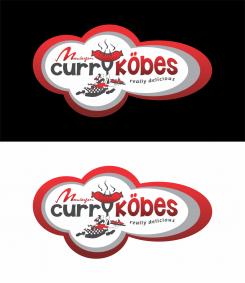
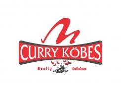
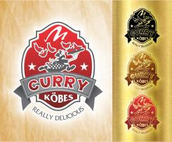
The traditional logo of our butcher shop contains a figure , our so -called " Köbes " - not to be confused with the Cologne waiter - we could imagine to name the new concept : Curry Köbes .
Our idea was to take that " Köbes " figure out of our ' old 'Logo ( mainly due to back recognizability reasons) and give it a modern up-to-date look. However, we are open to better suggestions !
- Modern and hip , yet serious logo that may like to represent an absolute break in style to our other business
- " Loud " and " delicious - hungry -making " broadcast
- Use as a word / figurative mark
- Manhattan - gray and red are the colors represented for mainly in the business , but also may quite possibly be a break in style , in the interest of better differentiation from other business
further information about us , please visit our website www.metzgerei27.de (which also requires a revision on occasion.
Photos of the facade and interiors can be requested by email.
Company description:
Target group:
Colors, favourites and other requirements
N.A.S.
-
-
No comments
-
This contest is finished. Its not possible to reply anymore.
-
-
-
metzgerei27 says :
not bad either, however,I still do like your first design best
-
This contest is finished. Its not possible to reply anymore.
-
-
-
metzgerei27 says :
not bad
-
This contest is finished. Its not possible to reply anymore.
-
-
-
pastrami says
It's a copy of my own logo, playing with the letter "Y" as a fork.
Don't copy, be original. -
N.A.S. says
first i do respect another designer, i dont think your design worth for copied & i never look design below 3 star "if" i want to copy another designer i will copy the highest star rank. fork is common tool for every designer to use for designing BBQ.this is original
-
metzgerei27 says :
sorry pastrami, but I'm afraid I have to agree with N.A.S. on the "common tool" statement. also I really do like N.A.S. approach throughout; maybe not a winner yet, but definetly very good
-
pastrami says
I'm not talking about "common tool", i'm talking about the idea which is the same here. Using the Y as a fork that's all. By the way i had 3 stars for my logos.
-
metzgerei27 says :
guys, stop fighting... steve jobs didn't invent the telefone either, he just brought it to the next level and called it Iphone... N.A.S. entry is the first one to implement the Köbes into the logo without making it look funny
-
This contest is finished. Its not possible to reply anymore.
-


