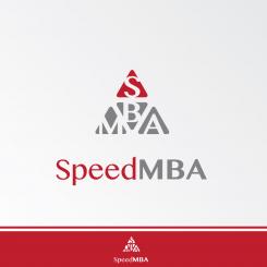
Logo + slide template for speed MBA course
Contest details:
Bronze
- Contest holder: Machiel
- Category: Logo design
- Total budget: € 199.00
- Start date : 12-08-2013 08:21
- Ending date : 31-08-2013 20:10
- Status : Ended
- Required formats: jpg,psd,pdf
- Relevant files: None
-
Available languages:


- Number of designs: 61
-
Response rate:
low high
Needs:
Company description:
See www.speedmba.com for more background info. At the moment I only have texts in Dutch, so use Google Translate. Please ignore the current site design, which may change. Deviate from it as you like.
Target group:
See "voor wie" in the menu on the site.
Colors, favourites and other requirements
I usually don't like figurative and/or complicated/messy logos. A logo separate from the name (it can be just a name logo) is not strictly required, although it has my interest.
nikolavasic
-
-
Description by designer nikolavasic:
Dear Michael, I think we've now got the power logo.
Best regards,
Nikola -
Machiel says :
Dear Nikola, thanks for the new attempt, but I'm afraid that you are more convinced than me. Whereas in the first pyramid every sub-triangle had its own meaning, the meaning of 2 or 3 of the 4 sub-triangles is lost in this new proposal. I really can't tell what the lower left and right small triangles are trying to tell me, which in my view is not a good sign to people who have never heared of the name. Besides that, the name part of the logo is still the same as the first time, although I've made clear from the beginning that this should also be adjusted. Sorry. Best regards, Michael
-
This contest is finished. Its not possible to reply anymore.
-
-
-
Machiel says :
Hi Nikolavasic, thanks for your contribution. I like the pyramid idea a lot more that the previous logo, but I'm not convinced by how it is elaborated; it should be stronger / tighter. Best regards, Machiel
-
This contest is finished. Its not possible to reply anymore.
-
-
-
Machiel says :
Hoi Nikolavasic, dank voor je inzending. Deze valt met het MBA-petje en het diploma voor mij teveel in de sfeer van figuratieve logo's. Het typografische deel vind ik te weinig kracht uitstralen. Sorry! Groet, Machiel
-
nikolavasic says
I apologize, if you can write a review in English. Some parts can not translate the best. thank you.
-
Machiel says :
Hi Nikolavasic, thanks for your contribution. My comment on the previous contribution was that I was not very keen on the MBA-hat and the graduation paper, because I generally don't like drawings of real objects in logo's, I prefer abstract. Besides that, the name part in this logo does not radiate enough strength to me. Best regards, Machiel
-
This contest is finished. Its not possible to reply anymore.
-
-
-
No comments
-
This contest is finished. Its not possible to reply anymore.
-


