Logo update for web agency
Contest details:
Bronze
- Contest holder: stendal
- Category: Logo design
- Total budget: € 199.00
- Start date : 09-03-2015 22:45
- Ending date : 25-03-2015 22:39
- Status : Ended
- Required formats: ai,pdf
- Relevant files: None
-
Available languages:

- Number of designs: 216
-
Response rate:
low high
Needs:
Company description:
Web and e-commerce agency. Design og development.
Target group:
B2B marketing and IT
Colors, favourites and other requirements
Our current logo can easily be mistaken for the logo of www.e-boks.dk.
Therefore we want to optimize the logo, but still keep the red color.
I've attached some inspiration from other logoes that i like.
Papermoon
-
-
Description by designer Papermoon:
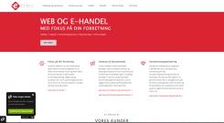
...see how it works on webpage
-
This contest is finished. Its not possible to reply anymore.
-
-
-
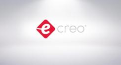
Description by designer Papermoon:
Dear Customer,
slighty changed the basic elements, so you won't loose your identity but on the other hand there is no more danger of confusion. Didn't change the red color. I kept it simple so I didn't use any drop-shadows, reflections...
cheers -
This contest is finished. Its not possible to reply anymore.
-


