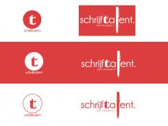
Logo wanted for writingcompany
Contest details:
Bronze
- Contest holder: dekraan
- Category: Logo design
- Total budget: € 199.00
- Start date : 27-10-2012 15:56
- Ending date : 10-11-2012 15:48
- Status : Ended
- Required formats: jpg,ai,pdf
- Relevant files: None
-
Available languages:


- Number of designs: 132
-
Response rate:
low high
Needs:
For a newly started company website for a textagency with a blog as the main part, I am looking for a logo. This should include the name of the agency, schrijftalent, and a strong, recognizable logo. It must also be clear and not too detailed, so it is usable on all kinds of dimensions.
The style I'm looking for, above all things creative, modern, sleek, young, professional, but also a bit 'cheeky and provocative. A unique negative space discovery has an edge!
Working with a cliché, such as a pencil or pen to me is not a problem. A cliché is recognizable, and immediately puts people on the right track. However, there must be a unique twist so the logo stands out from the crowd.
Examples that appeal to me i.a.
http://logopond.com/gallery/detail/180071
http://beta.marblar.com/
http://www.bartodell.com/core/i/senterbrands.png
Good luck!!
Company description:
Target group:
Colors, favourites and other requirements
GaetanBosloup
-
-
Description by designer GaetanBosloup:
Hello,
I remain at your entire disposal.
Have a good day! -
dekraan says :
The idea to combine the S and T is good, but here, I do not really understand what you did with the T, while the pen as an L is way too big for my taste. I would prefer a symbol with a loose companyname (so the circle), but something else..
-
GaetanBosloup says
Hello,
Thanks for your comment, i don't understand very well that you want exactly. I wll reduce the pen. The "T" looks like a font calligraphy, and it's the letter at the center of the word (where the eye lands first).
For the logo (on the left), what don't you like? The circle? What do you prefer?
Thank you for your answer.
Have a good day
PS: Sorry for my bad english. -
dekraan says :
Hi there, well... my English is as bad as yours, maybe even worse :) what I mean is: I prefer a logo such as the bartodell one from my examplelist: a companyname below, and then above a symbol. Just like your examples on the left :)
What I don't understand, is what you did with the T inside that circle. It has a double line, it seems? What does that represent?
Greets! -
This contest is finished. Its not possible to reply anymore.
-

