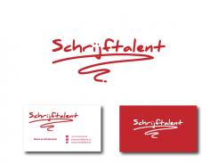
Logo wanted for writingcompany
Contest details:
Bronze
- Contest holder: dekraan
- Category: Logo design
- Total budget: € 199.00
- Start date : 27-10-2012 15:56
- Ending date : 10-11-2012 15:48
- Status : Ended
- Required formats: jpg,ai,pdf
- Relevant files: None
-
Available languages:


- Number of designs: 132
-
Response rate:
low high
Needs:
Wanted: Logo for a (freelance) Textagency. This logo is used on the website, and should be in a red box with the dimensions 270 (width) x 146 (height).
For a newly started company website for a textagency with a blog as the main part, I am looking for a logo. This should include the name of the agency, schrijftalent, and a strong, recognizable logo. It must also be clear and not too detailed, so it is usable on all kinds of dimensions.
The style I'm looking for, above all things creative, modern, sleek, young, professional, but also a bit 'cheeky and provocative. A unique negative space discovery has an edge!
Working with a cliché, such as a pencil or pen to me is not a problem. A cliché is recognizable, and immediately puts people on the right track. However, there must be a unique twist so the logo stands out from the crowd.
Examples that appeal to me i.a.
http://logopond.com/gallery/detail/180071
http://beta.marblar.com/
http://www.bartodell.com/core/i/senterbrands.png
Good luck!!
Company description:
Target group:
Colors, favourites and other requirements
Esther
-
-
Description by designer Esther:
Variant.. en voorbeeld van een mogelijke verwerking op een visitekaartje. Eenvoud en goed herkenbaar.
-
dekraan says :
Ik vind het er leuk uitzien, maar het past voor mijn gevoel niet bij de verder redelijk strakke moderne feel van de site!
-
This contest is finished. Its not possible to reply anymore.
-

