Logo Wine Bar / Tapas
Contest details:
Bronze
- Contest holder: robinsky
- Category: Logo design
- Total budget: € 229.00
- Start date : 27-07-2015 10:44
- Ending date : 14-08-2015 10:39
- Status : Ended
- Required formats: jpg,psd,ai,pdf
- Relevant files: None
-
Available languages:


- Number of designs: 266
-
Response rate:
low high
Needs:
We want an agreement with the hotel logo :
-Young ( Thirty )
-convivial ,
-original
- " trend " .
The name " Le Saint Jus " must be included, " Saint" must remain words and unabridged "St" , the word " wine bar / tapas " little or no figure .
The logo will be returned to the filming of the establishment of the windows , menus, teaches, work clothes and all other materials communication .
We are seeking something " graphic", " punchy " the world of wine and / or little or no tapas appear in the logo.
PS: I like the trendy " vintage" often used to breweries, barber shop , etc ...
Company description:
Le Saint Jus , wine bar / tapas after work is dedicated to the world of wine and tapas , the property will " held " but casual, stopping there is little lonely or friends to take a drink or eat .
Target group:
From 30 to 60 years , men and women , good wines lovers and / or followers of Tapas .
Colors, favourites and other requirements
The colors used for are:
- wood
- stone
- Steel
- black
The furniture that wants dotted with colors.
Anne Com
-
-
No comments
-
This contest is finished. Its not possible to reply anymore.
-
-
-
Anne Com says
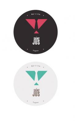
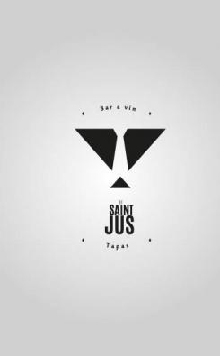
J'ai voulu intégrer le coté "saint" avec des ailes stylisées. A l'intérieur se trouve une cravate pour rappeler que c'est un after work . le tout forme un verre, un grand triangle pour le verre, et le petit pour le pied du verre.
J'attend vos retours ! -
This contest is finished. Its not possible to reply anymore.
-
-
-
No comments
-
This contest is finished. Its not possible to reply anymore.
-
-
-
No comments
-
This contest is finished. Its not possible to reply anymore.
-
-
-
No comments
-
This contest is finished. Its not possible to reply anymore.
-
-
-
No comments
-
This contest is finished. Its not possible to reply anymore.
-
-
-
Anne Com says
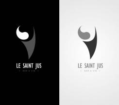
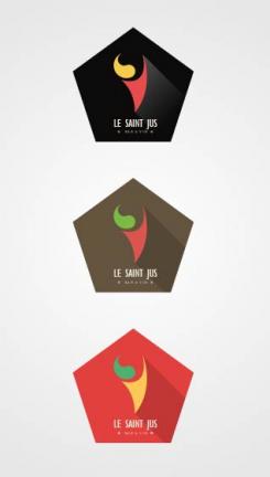
J’ai choisi de m’orienter sur l’aspect convivial et chaleureux d’un bar. Pour cela, j’ai travaillé des formes rondes dans l’esprit d’un piment pour rappeler le côté espagnol des tapas . En parallèle, les formes sont assemblées pour permettre de voir un espace négatif représentant un ballon de verre a vin.
Dans l'attente de vos retours ,
Cdt -
This contest is finished. Its not possible to reply anymore.
-

