Good morning Marisje,
attached the latest corrections, if there should be anything else left to adjust, it'll be no problem to do this later on ;) Have a nice day, Dagmar
Mediation4People
- Contest holder: Marisje ontwerpt
- Category: Logo design
- Status: Ended
Start date: 13-12-2015
Ending date: 25-12-2015
It all started with an idea...
A short, interactive guide helped them discover their design style and clearly captured what they needed.
Brandsupply is a platform where creative professionals and businesses collaborate on unique projects and designs.
Clients looking for a new logo or brand identity describe what they need. Designers can then participate in the project via Brandsupply by submitting one or more designs. In the end, the client chooses the design they like best.
Costs vary depending on the type of project — from €169 for a business or project name to €539 for a complete website. The client decides how much they want to pay for the entire project.
Dagmar it looks very nice! And I'm very happy with it.
Whats is gonna happen next? I ranked you with 5 stars.
Have a Merry X-mas Day. M
What happens next is up to you ;) Whenever the contest is over, you have to choose a winner ;))
Good morning ;) Attached some variations with the new subline, greetings Dagmar
Hallo VL,
Almost X-Mas time.
The first one, with te longest line is the best.
But we are back from were we came from, because the line will be:
Mediators met hart voor de mens achter het conflict.
And so the circle is round: the classic look with business look but the under title softer.
You can make things definitely ready, this way. A last look and you will earn the 5 stars.
I need also an avatar, and a pink version as well.
Looking forward for your last version.
VL again a change:
the second one:
Met aandacht voor de mens achter het conflict.
Sorry for the trouble
Hi Marisje,
I will prepare this tomorrow morning, cause now I'm a bit busy ;)) So which subline? "Mediators met hart voor de mens achter het conflict" or "Met aandacht voor de mens achter het conflict"? And the size like the second version from this list?
I'm getting a bit confused ;) Have a nice xmas evening, Dagmar
Hi Dagmar, of course no problem and I wish you nice Xmas and a Happy New Year.
So it is gonna be a X-mas logo. How relevant can this be for a mediation....peace on earth and no conflicts:-)
I can understand you did get confused. So did I ;-)
I make it more simpel this X-mas and more straight and clear. So at last we choose the latest version in number 2 (not totally straight):
Aandacht voor de mens achter het conflict
Thanks !!!! I will look forward to it tomorrow. Take your time, but I believe it has to be for 1 o clock.
Variation 3 ;) greetings
Thanks again for this quick delivery!
Hello VL,
Most of the people ar convinced now that this must be the one. More in balance and more classic. Still arguing about the under title.
Therefore I am sure you have to deliver us a logo with or without underscore.
For now I ask you to change the under title in to:
Aandacht voor de mens achter het conflict.
And I let you decide what looks best. To centre it or not. Because the sentence is somewhat shorter.
The best is we could change it in time, if possible. Many opinions make better result but make discussions also more difficult. Now and in the future ;-)
Greetings M
sure ;) greetings, D.
Hello VL,
the first design you made with no square and the graphic figure/4 in pink, has no capitals. Is it possible to make exact this one bigger (no capitals) but more readable? And also how it would like in house style?
Underscore is shorter and not even big as the letters above. That looks nice too because the lettre type is different.
The one with bleu definitely isn't the one I will choose.
Thanks again and we are getting there. Best regards, M
Hello Marisje,
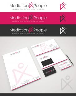
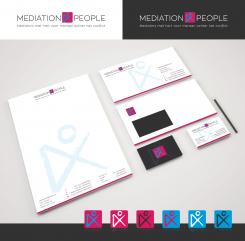
attached the version with the new subline you sent yesterday and an according design for your housestyle ;) Best regards, Dagmar
Hello VL,
I believe we are getting there. Still doubting to choose the classical variation with the two colors or the one with the bleu. I hope to make a decision later on this day.
Question: how and what do you deliver me? Can I for instance order the lay out of the business cards, paper and of the logo etc? And is it also possible to get the logo in different colours and with or without the underscore?
What happens after the match is over? Can we stay in contact? Greetings, M
If is is not to much work I would like you to aks you to show me the same picture with the house style, but then with only the pink and black combination; the more classic look.
Greetings
Thanks again! Especially for the quick delivery! Greeting M.
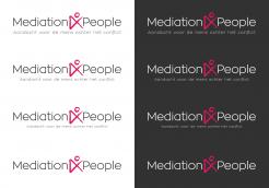
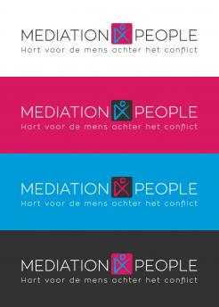
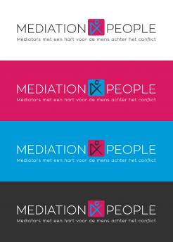
This is the version with the shorter subline... To your question concerning the use of the additional blue color:
In my opinion its also a nice combination, as you said, it seems quite fresh, if you use it. On the other hand its a bit more classic, just to use two colors. So it depends, if you're more heading towards a classy style or a fresh one ;) If there's anything else I can optimize, let me know, Dagmar
Thanks again, Dagmar. I believe the other one is better.
Maybe you can change the underscript in too:
Mediation met hart voor mensen achter het conflict. This is shorter.
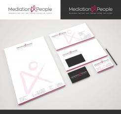
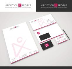
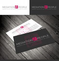
Can you also show how this will look on a business card and a letter. For the white and the black color? Thnaks
excuse me: I ment:
Mediators met hart voor mensen achter het conflict.
Good morning Marisje,
attached the version in the colors you wanted to see and with a slightly thicker font. Kind regards, Dagmar
Thanks VL, looks nice. I am also still wondering if my underscore is to long. What do you think? We could compress it to Hart voor de mens achter het conflict. It should be more readable then.
Which do you prefer. With the touch of bleu or without?
Hello Marisje,
thank you for your feedback. Based on this I designed a version with the little figurine within a square as you suggested, as well as an example how to play with the image sign for backgrounds or as stand-alone. And so you can also use it for your facebook etc accounts. Looking forward to your reply, kind regards, Dagmar Lange
Hello VL,
Thanks again.
I tried to print things but then the underscore is almost unreadable. Is it possible to make all things some what thicker? Just to see how this looks.
And another question for you: what do you think. Is another collor needed next to the pink and grey? For instance bleu or do you think these two colours together are nice and more fresh? What doe you think?
Als I would like to see the logo withe the background in pink, if possible. (letter in big white) Thanks. Greeting M
And also possible to look for some blue to combine; to see what I mean, see : themediananny.nl
No comments
Beste Virtual Lies,
Ik vind dit een erg mooi strak ontwerp. De 4 is op een mooie manier vormgegeven en op deze manier kan er ook een vierkant logootje, klien worden gemaakt tv twitter en Fb etc.
De ronde vormen of het hartje vind ik te vrouwelijk.
 Nederland
 België
 France
 Deutschland
 Österreich
 International
