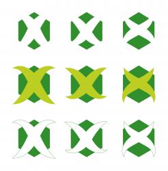
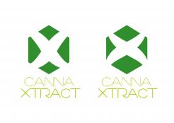
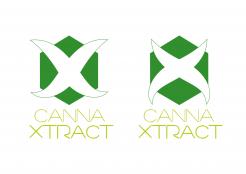
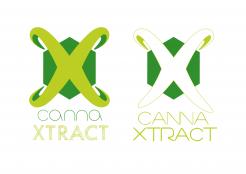
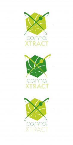
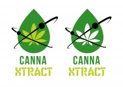
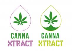
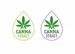
New logo for a brand of products in the cannabis
Contest details:
Silver
- Contest holder: izneba
- Category: Logo design
- Total budget: € 329.00
- Start date : 08-11-2014 22:24
- Ending date : 22-11-2014 22:15
- Status : Ended
- Required formats: jpg,ai,pdf
- Relevant files: None
-
Available languages:


- Number of designs: 182
-
Response rate:
low high
Needs:
Company description:
We are the company ' cannaxtract ' abbreviations of cannabises and extracts, we make legally in Switzerland products with hemp such as eLiquide for electronic cigarette and oil of care.. Other products to come, we are specialized in the extractions of hemp for its active ingredients. Products will be for sale on the Internet mainly. They contain mainly a called substance cannabidiol or CBD. This not psychoactive substance is legal in Swiss and very interesting on the behavioral plan, the anti-anxiety, the anti-nerves, relaxing and medical. Site: www.cannaxtract.ch (the existing logo is not 'personalized' and a little bit old-fashioned)
Target group:
Toutes les catégories de personnes, tranches d'âge, sont intéressées par des produits au cannabidiol.
Colors, favourites and other requirements
Green colors rather. Can be mixed in a contrasted like color pink-purple style. Enough flash, bright,
The police can be in two words canna and xtract? To see, it seems to me more readable..
kreustplastika
-
-
No comments
-
This contest is finished. Its not possible to reply anymore.
-
-
-
No comments
-
This contest is finished. Its not possible to reply anymore.
-
-
-
No comments
-
This contest is finished. Its not possible to reply anymore.
-
-
-
No comments
-
This contest is finished. Its not possible to reply anymore.
-
-
-
No comments
-
This contest is finished. Its not possible to reply anymore.
-
-
-
No comments
-
This contest is finished. Its not possible to reply anymore.
-
-
-
izneba says :
Bonsoir,
Très bien, la feuille très intéressante, l'hexagone soit pointe en haut ou pointe en haut légèrement incliné. 2 couleurs maxi serait top.. Év. essayer de travailler un X sur un hexagone ou inversement..Év une police plus sobre et le logo avec ce X qui donnerait l'indication de la marque.. Ensuite le logo sera utilisé sans la police sur des petits objets..Merci -
kreustplastika says
Bonjour, merci du retour
Je revient vers vous avec ces nouvelles modifications. -
This contest is finished. Its not possible to reply anymore.
-
-
-
No comments
-
This contest is finished. Its not possible to reply anymore.
-
-
-
No comments
-
This contest is finished. Its not possible to reply anymore.
-
-
-
Description by designer kreustplastika:
Dans un style différent ..
-
This contest is finished. Its not possible to reply anymore.
-
-
-
No comments
-
This contest is finished. Its not possible to reply anymore.
-
-
-
No comments
-
This contest is finished. Its not possible to reply anymore.
-
-
-
izneba says :
Ok très sympa mais déjà pris par goldenxtrx.. Et peut être trop de goutes du coup..Mais le concept subtil simple et percutant c'est dans l'idée ! merci
-
izneba says :
La police très intéressant dans ce style..Peut être mettre l'effet 'rayures' uniquement sur xtract.. Idée.. Souvent les designers mettent le xtract plus petit que canna à cause que y'a 1 lettre en plus mais je ne trouve pas top le xtract plus petit..Merci
-
kreustplastika says
Merci, j'ai quelques autres idées de graphismes en tête en gardant ce même esprit typographique
-
This contest is finished. Its not possible to reply anymore.
-

