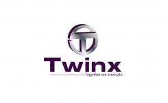
New logo for Twinx
Contest details:
- Contest holder: pvdwerf
- Category: Logo design
- Total budget: € 249.00
- Start date : 06-03-2014 08:25
- Ending date : 06-04-2014 07:58
- Status : Ended
- Required formats: jpg,ai,
- Relevant files: None
-
Available languages:


- Number of designs: 164
-
Response rate:
low high
Needs:
Some keywords for the new style:
Fresh, no nonsense, fast track business development, hands on approach, innovation, project organisation, cooperation
Wanted look:
YES: Business, corporate, energetic, dynamic, innovation
NO: the vague/blurry/soft creative look
Wanted colors:
We'd prefer something towards the colors of the old logo as the colors are associated with innovation, but we're open for good suggestions of course.
Basic colors: Red, purple
Wanted design:
Something with an association with materials (high-tech), something 3D-ish, more complex. The old logo was nice in the sense that it had something dynamic (and the flash animation).
Animation itself isn't required, but a dynamic look is.
Company description:
Twinx specialises in project- and programmangement with a lot of experience with larger innovationprojects and business development.
Twinx stand for Together we innovate
Target group:
R&D management, business developers
Colors, favourites and other requirements
See the general description
Pegaze3000
-
-
Description by designer Pegaze3000:
Hello,
Here is my proposition.
Best regards -
pvdwerf says :
Hi, thanks for your design. We like it but have some comments. The look seems a bit out of balance. The word Twinx vs the logo above it are of difference sizes and looks. We like that you have kept Twinx as 1 word which is how it should be. We'd like the font and look of Twinx to be a bit more "friendly" and/or more dynamic. It would be nice if the word+logo would look more as an integrated/matching whole. Hope you can work with that. Thanks so far!
-
This contest is finished. Its not possible to reply anymore.
-

