New logo for Twinx
Contest details:
- Contest holder: pvdwerf
- Category: Logo design
- Total budget: € 249.00
- Start date : 06-03-2014 08:25
- Ending date : 06-04-2014 07:58
- Status : Ended
- Required formats: jpg,ai,
- Relevant files: None
-
Available languages:


- Number of designs: 164
-
Response rate:
low high
Needs:
Some keywords for the new style:
Fresh, no nonsense, fast track business development, hands on approach, innovation, project organisation, cooperation
Wanted look:
YES: Business, corporate, energetic, dynamic, innovation
NO: the vague/blurry/soft creative look
Wanted colors:
We'd prefer something towards the colors of the old logo as the colors are associated with innovation, but we're open for good suggestions of course.
Basic colors: Red, purple
Wanted design:
Something with an association with materials (high-tech), something 3D-ish, more complex. The old logo was nice in the sense that it had something dynamic (and the flash animation).
Animation itself isn't required, but a dynamic look is.
Company description:
Twinx specialises in project- and programmangement with a lot of experience with larger innovationprojects and business development.
Twinx stand for Together we innovate
Target group:
R&D management, business developers
Colors, favourites and other requirements
See the general description
Rtist4u
-
-
Description by designer Rtist4u:
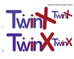
Feedback is greatly appreciated!
-
This contest is finished. Its not possible to reply anymore.
-
-
-
Description by designer Rtist4u:
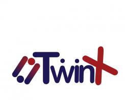
a little different icon, but two working together, at any rate.
-
This contest is finished. Its not possible to reply anymore.
-
-
-
Description by designer Rtist4u:
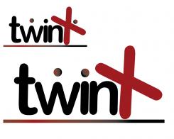
Going with "motion" in the X... provided two forms of basically the same idea, but the first (top) has three "dots". I'm leaning towards the second (lower) for "twin" dots...
-
This contest is finished. Its not possible to reply anymore.
-


