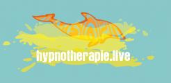
Online Hypnotherapy logo
Contest details:
- Contest holder: Qris Du
- Category: Logo design
- Total budget: € 150.00
- Start date : 05-09-2021 00:04
- Ending date : 10-09-2021 17:50
- Status : Ended
- Relevant files: None
-
Available languages:


- Number of designs: 31
-
Response rate:
low high
Needs:
Company description:
An elongated design because the logo has to fit on a fairly narrow line on the website and still be legible.
In the appendix you will find a craft example, especially for what we like in terms of atmosphere and toughness. The white letters are illegible and it is not at all correct for a logo. Hence this competition and we are very curious about your designs! Of course we are open to alternative designs.
So we want a cool logo with a cool font and the whole must have a minimalistic look. More is less. A logo that radiates reliability, is contemporary, but also has something mystical at the same time.Or colorfull and sexy. We are thinking of a logo with a transparent background.
Incorporate our entire website name into the logo: hypnotherapie.live
The homepage of the template we have in mind for our website can be found in the appendix. The photo we will use there has oceanblue background. See attachement.
The logo falls on our homepage in a photo with dark blue ocean water. Hence the transparent background. We are thinking of, among other things, warm orange (bitcoin/Nationale Nederlanden), a color that goes well with blue and green and then also goes well with white for the underlying web pages.
The Maori dolphin in your design is reminiscent of the dolphin in our appendix.
But you can also surprise us with another Maori dolphin. As long as it's just as tough and tight.
On the website we offer healing trajectories that work with a unique mix of hypnosis, constellations, NLP, voice monologue and other techniques, in which the dolphin plays a special role.
All our sessions we offer are live and online. Our tropical location (ABC islands) is not decisive, but it is inspiring for the development of our unique working method.
So no palm trees and dolphins jumping through hoops! ;)
Target group:
Colors, favourites and other requirements
logomaker
-
-
No comments
-
This contest is finished. Its not possible to reply anymore.
-
-
-
No comments
-
This contest is finished. Its not possible to reply anymore.
-
-
-
No comments
-
This contest is finished. Its not possible to reply anymore.
-
-
-
Qris Du says :
Sorry maar het mist de stijl wat we zoeken.
-
This contest is finished. Its not possible to reply anymore.
-
-
-
No comments
-
This contest is finished. Its not possible to reply anymore.
-
-
-
No comments
-
This contest is finished. Its not possible to reply anymore.
-
-
-
No comments
-
This contest is finished. Its not possible to reply anymore.
-
-
-
logomaker says
Ga ik laten zien
-
This contest is finished. Its not possible to reply anymore.
-
-
-
Qris Du says :
Dank voor de aanpassingen. Die middelste uitvoering is krachtiger. Is het lastig om de invulling van de dolfijn wat meer Maori te maken? Hartelijks, Qris
-
This contest is finished. Its not possible to reply anymore.
-
-
-
Qris Du says :
Hallo Logomaker. Dank voor je inzendingen. Deze dolfijn komt al meer in de buurt van wat we willen zien, als je hem vergelijkt met Mooiniet. Het water is zeker niet wat we willen zien. Dat mag weg. Strakke verfstrepen geven een ander effect. De letters zijn mooi dik maar net als in ons eigen voorbeeld onleesbaar als logo zoals we al hadden opgemerkt. ;) Misschien kun je eens wat spelen met de positie van dolfijn en de kleur van de letters?
-
Qris Du says :
Hartelijks, Qris
-
This contest is finished. Its not possible to reply anymore.
-
-
-
No comments
-
This contest is finished. Its not possible to reply anymore.
-

