PLACEMIS
Contest details:
Bronze
- Contest holder: placemis
- Category: Logo design
- Total budget: € 229.00
- Start date : 18-01-2016 16:37
- Ending date : 25-01-2016 16:29
- Status : Ended
- Required formats: jpg,ai,pdf
- Relevant files: None
-
Available languages:


- Number of designs: 202
-
Response rate:
low high
Needs:
It must clear the seriousness but also confidence and security.
Company description:
PLACEMIS
Saving , Investing , Exempt from taxation .
Financial advisory and real estate business.
Our job is to help our customers to put their money and reduce their taxes.
Our operation is to provide a comprehensive study of the heritage of our customers and offer them products adapted to their situation .
We offer financial products ( life insurance ...) and real property (new or restored ) .
Our employment company currently 7 people working on 4 departments .
We are in full development and we wish grow throughout France , that's why we want change and boost our brand image .
Target group:
People between 30 and 50 years, mostly executives , manager of SMEs and liberal activities.
Colors, favourites and other requirements
Colours: blue or green
The logo should be composed only of the company name using a current and uncluttered police. The first letter can optionally be used in addition to the name. To avoid real estate icons already seen ( house, building ) and financial ( euro currency ...)
To the slogan , it is not yet defined .
STENANO
-
-
No comments
-
This contest is finished. Its not possible to reply anymore.
-
-
-
Description by designer STENANO:
Voici mon projet:
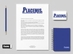
Une typo simple mais imposante pour montrer une stabilité.
une barre de soulignement sous le texte pour a nouveau montré une stabilité ainsi qu'une ligne de conduite bien définie afin d'inspirer la confiance. Le "P", plus élevé que les autres lettres, quant a lui montre la force de votre société, une observation du marché afin de conseiller vos clients de la meilleur manière. -
This contest is finished. Its not possible to reply anymore.
-


