PLACEMIS
Contest details:
Bronze
- Contest holder: placemis
- Category: Logo design
- Total budget: € 229.00
- Start date : 18-01-2016 16:37
- Ending date : 25-01-2016 16:29
- Status : Ended
- Required formats: jpg,ai,pdf
- Relevant files: None
-
Available languages:


- Number of designs: 202
-
Response rate:
low high
Needs:
It must clear the seriousness but also confidence and security.
Company description:
PLACEMIS
Saving , Investing , Exempt from taxation .
Financial advisory and real estate business.
Our job is to help our customers to put their money and reduce their taxes.
Our operation is to provide a comprehensive study of the heritage of our customers and offer them products adapted to their situation .
We offer financial products ( life insurance ...) and real property (new or restored ) .
Our employment company currently 7 people working on 4 departments .
We are in full development and we wish grow throughout France , that's why we want change and boost our brand image .
Target group:
People between 30 and 50 years, mostly executives , manager of SMEs and liberal activities.
Colors, favourites and other requirements
Colours: blue or green
The logo should be composed only of the company name using a current and uncluttered police. The first letter can optionally be used in addition to the name. To avoid real estate icons already seen ( house, building ) and financial ( euro currency ...)
To the slogan , it is not yet defined .
Axel Sonnet
-
-
Description by designer Axel Sonnet:
Le logo s'adapte à tout format ( horizontal, vertical) et peux être mis sur n'importe quel fond (clair, foncé).
-
This contest is finished. Its not possible to reply anymore.
-
-
-
Description by designer Axel Sonnet:
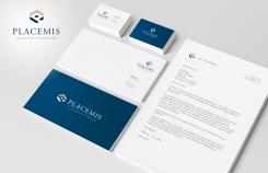
Exemple sur les différents supports de communications.
-
This contest is finished. Its not possible to reply anymore.
-
-
-
Description by designer Axel Sonnet:
Variation sur le même concept
-
Axel Sonnet says
Avec cette variation, on a également la notion d'immobilier avec la flèche qui forme un toit.
-
This contest is finished. Its not possible to reply anymore.
-
-
-
Axel Sonnet says
On a un picto contenant le "P" et une notion d'expansion, de fructification et de positivité avec la flêche vers le haut à droite, le carré central du "p" représente le patrimoine, les biens que le client possède, ses biens sont donc sécurisés et optimisés.
-
This contest is finished. Its not possible to reply anymore.
-
-
-
No comments
-
This contest is finished. Its not possible to reply anymore.
-
-
-
Description by designer Axel Sonnet:
Bonjour, voici mon design avec plusieurs variations.
N'hésitez pas à me faire part de vos remarques afin d'affiner la qualité de ces designs. -
This contest is finished. Its not possible to reply anymore.
-

