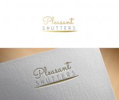
Pleasant Logo
Contest details:
Gold
- Contest holder: Brandon Lang
- Category: Logo design
- Total budget: € 399.00
- Start date : 04-02-2016 19:49
- Ending date : 11-02-2016 19:47
- Status : Ended
- Required formats: jpg,ai,pdf
- Relevant files: None
-
Available languages:

- Number of designs: 62
-
Response rate:
low high
Needs:
Company description:
We sell Plantation Shutters (interior) and interior window coverings, from Blinds, Shades, Draperies, and basically all interior types of window coverings.
Target group:
Women and couples.
Colors, favourites and other requirements
Make sure you look at the design examples I uploaded. I am looking for something that is "artsy", "a little playful", "friendly" and all rolled up with a "designer look & feel". This logo needs to lean a little more towards women than men. I am wanting for the word "Pleasant" to resonate in the logo. So please use that. Thanks.
Zane_Gereisa
-
-
Description by designer Zane_Gereisa:
And here is the version where the sprouts are coming out of the letter T and butterfly is connected with P. So there is a bold connection between icons in the design.
I made also one example with the name - BLINDS, so you can see how it would look like in a case you want to change the name.
Looking forward to hearing from you,
Regards,
Zane -
This contest is finished. Its not possible to reply anymore.
-
-
-
Description by designer Zane_Gereisa:
Hello,
I made the same concept but little bit changed version. I made the butterfly look like its coming out of the letter P and going upwards to create this symbol of growth.
Looking forward to hearing from you,
Regards,
Zane -
This contest is finished. Its not possible to reply anymore.
-
-
-
Description by designer Zane_Gereisa:
I wanted to provide you also with an option where the letter P from Pleasant is used as an brand identity - the main element in the icon. I made the negative space using elements from floral world and used the same vibrant colours. For the font here I chose neutral and clean font - to give the whole harmony.
Looking forward to hearing what you think about this kind of idea.
Regards,
Zane -
This contest is finished. Its not possible to reply anymore.
-
-
-
Description by designer Zane_Gereisa:
Hello,
I made the logo including butterfly and used vibrant and positive colours in design.
I made the subtitle in simple font, so it could be easily changeable and would not affect rest of the design.
I made another version where I made the icon from letter P that I will provide you in a minute.
Looking forward to hearing from you,
Best Regards,
Zane -
This contest is finished. Its not possible to reply anymore.
-
-
-
Description by designer Zane_Gereisa:
Hello,
To create the accent to name Pleasant I made it in gold, that would associate with something beautiful and nice to an eye. As well its appealing to women target group and not disturbing to man.
For the name under I chose elegant and clean font, that would be easy changeable if you would decide to go for another name and that would not change the concept of logo design.
Looking forward to hearing from you,
Regards,
Zane -
This contest is finished. Its not possible to reply anymore.
-

