Redesign of the logo Milkiland. See the logo www.milkiland.nl"
Contest details:
Gold
- Contest holder: Yevhen
- Category: Logo design
- Total budget: € 479.00
- Start date : 27-03-2014 14:38
- Ending date : 25-04-2014 14:36
- Status : Ended
- Required formats: jpg,ai,pdf
- Relevant files: None
-
Available languages:


- Number of designs: 178
-
Response rate:
low high
Needs:
2) the only constant thing to keep from the current corporate logo is the word Milkiland. All the other elements of the current logo including colour, font, etc., could be changed or removed
3) the logo should have a simple outline, shape to place it against any background of the package
4) the colors could be blue, green, white, red or any other natural colors to support the idea of dairy products
Why do we need that?
1 The corporate logo Milkiland does not fit for sales of European cheese on the markets of Ukraine, Russia, Asia and other countries.
2 It doesn’t correspond the meaning of cheese or dairy products from the Western Europe. Dutch origin is especially valuable
3 We need to compete with a German brand Hochland (Hochland Kaasland)on the Ukrainian, Russian and other Eastern markets.
4 We can compete if we have a rather Dutch name and image of the brand
The other Competitors:
Arla, Milkana, Valio, Bel, President (Lactalis), Milchland
Company description:
Target group:
Colors, favourites and other requirements
demizool
-
-
Description by designer demizool:
Hi Yevhen!
Thank you for the feedback so far. I think we are really getting somewhere!
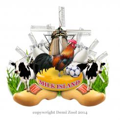
You were not a big fan of the last design because it was a bit minimalistic. So this time I went with a maximalistic approach. There is a lot of detail in the new logo. That way you really stand out from your competitors!
Also there are a lot of Dutch elements in the picture. Everyone will look at this logo and say: “hey… that is from holland!”. There is cheese of course but also other dutch things. Also I put a cock in the center because you see them a lot on farms. The balls are there to make the logo playful, otherwise it all becomes a bit too serious I think.
p.s. the windmill is a stick image. That means if you choose the logo I will have to buy the photo 8 times (8 windmills in the logo). I could also remove a few windmills to keep the price down.
Your friend,
Demi -
Yevhen says :
Hi Demi,
we are far from buying the photos at the moment.
Thank you for max. vision.
I would say it's funny, I'm not sure we can go so far from serious matters.
You know, cheese is a conservative thing. Here rules tradition.
Let's see what we are going to have further.
Thanks,
Yevhen
-
This contest is finished. Its not possible to reply anymore.
-
-
-
Description by designer demizool:
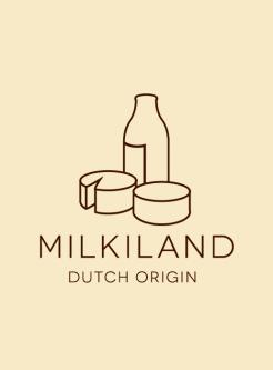
Thanks for you reaction Yevhen! i also have this one lying on the plank, maybe this is more in your flavor.
I choose natural colors but with a minimalistic outline so it had a modern and still authentic feel'n look
Let me know what you think of this style
Forever yours,
Demi -
Yevhen says :
No it could not go, sorry. too minimalistic
-
This contest is finished. Its not possible to reply anymore.
-
-
-
Description by designer demizool:
Hallo Yevhen,
When I see this competition I say to myself: "wow, that is one for me!”. When I was a child I grow up on the farm and play with the cows. I even helped my father pull the cows.
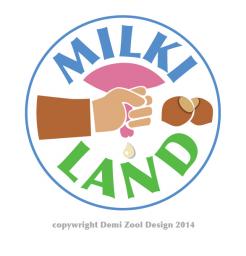
Now for the logo: the theme of the logo is ‘milking’. This is a very natural concept and it brings the brand close to the fields. In the logo you can see the farmer milking the cow. I believe that is what people want right now: not electrical pulling but real handwork. To make it complete I add two extra nuts.
When I started the experimentation fase I tried a photo-realistic approach. But then I thought: “lets make it modern”. So then I removed a lot of details to keep the design simple and clean. That way, you can also use the logo for a iPhone icon or placemats.
If you want I can experiment more with different colours for the farmer’s hand. Right now the farmer is white, but I can try different colors. What do you think?
I look forword to your opinion!!
Demi -
Yevhen says :
Hello Demi,
I don't agree that modernity is handmilkilng.
I don't see how to experiment within your concept.
Try to get something different please
Best wishes,
Yevhen
-
This contest is finished. Its not possible to reply anymore.
-


