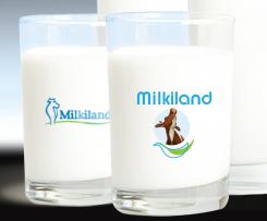
Redesign of the logo Milkiland. See the logo www.milkiland.nl"
Contest details:
Gold
- Contest holder: Yevhen
- Category: Logo design
- Total budget: € 479.00
- Start date : 27-03-2014 14:38
- Ending date : 25-04-2014 14:36
- Status : Ended
- Required formats: jpg,ai,pdf
- Relevant files: None
-
Available languages:


- Number of designs: 178
-
Response rate:
low high
Needs:
2) the only constant thing to keep from the current corporate logo is the word Milkiland. All the other elements of the current logo including colour, font, etc., could be changed or removed
3) the logo should have a simple outline, shape to place it against any background of the package
4) the colors could be blue, green, white, red or any other natural colors to support the idea of dairy products
Why do we need that?
1 The corporate logo Milkiland does not fit for sales of European cheese on the markets of Ukraine, Russia, Asia and other countries.
2 It doesn’t correspond the meaning of cheese or dairy products from the Western Europe. Dutch origin is especially valuable
3 We need to compete with a German brand Hochland (Hochland Kaasland)on the Ukrainian, Russian and other Eastern markets.
4 We can compete if we have a rather Dutch name and image of the brand
The other Competitors:
Arla, Milkana, Valio, Bel, President (Lactalis), Milchland
Company description:
Target group:
Colors, favourites and other requirements
4+
-
-
Description by designer 4+:
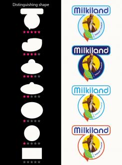
Look and convince yourself, the power of the form.
-
Yevhen says :
Thanks, the top shapes are here
The logos of the competitors are available here.
http://www.ex.ua/136742679474
or https://drive.google.com/file/d/0B3ra5RoWe4H1T1ducktpd2dMWGM/edit?usp=sharing
Our shape could be not like theirs.
What would you recommend? -
4+ says
Hi Yevhen,
As I described earlier, I find the 5 star shape, my last entry, the strongest.
See links *****, this is the kind of Milkiland!
It is unique in shape and appearance.
4+ -
This contest is finished. Its not possible to reply anymore.
-
-
-
Description by designer 4+:
Ever thought it would be so difficult?
In this new entry, I've processed your main comments.
The oval shape is not the most distinctive shape as compared with the conqurentie.
Against it is my first submission the most distinctive form of all submissions in relation to the conqurentie.
Regardless of the name must at one point only by seeing the shape and the color a direct link with Milkiland.
There should be absolutely no relationship suggested, for example, "Arla" or "Milkana" just by the shape already!
Distinguishing feature, readability and radiance in relation to the product are the priorities in random order.
Given the time all of us remaining, I recommend you to react quickly to any changes that lead to the desired result.
Of course, minor adjustments can also be performed. Even after the competition
With creative greeting,
4+ (Harry) -
This contest is finished. Its not possible to reply anymore.
-
-
-
4+ says
Hello Yevhen,
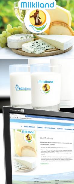
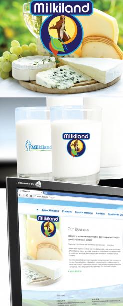
You don't like the Cheese behind?
From 4 to 2 stars down...
Could you give me more feed back please.
4+ -
This contest is finished. Its not possible to reply anymore.
-
-
-
No comments
-
This contest is finished. Its not possible to reply anymore.
-
-
-
Yevhen says :
Hi,
It looks interesting.
Especially good is the font of Milkiland and the bottom with those leaves. The photo of the cow is questionable as it is completely for milk whereas we produce and sell much of cheese as well.
If you could think a little bit what to change in the middle of the logo it would be great.
Thanks,
Yevhen -
4+ says
Well Yevhen,
That's what I call a good rating, thank you.
There are a number of animals which produce milk which we use
for the dairy industry.
The cow is it still the most famous.
I think the cow remains and a cheese is added to the bottom or circle behind the cow.
What do you think of that idea?
Worked example follows In a minute.
With creative greeting,
4 + -
Yevhen says :
Hi friend,
Cheese behind could be nice.
What I'm concerned is how to get all the elements together. I mean it has to look well against different package's backgrounds. When we do not have all included in one shape, have no margins, how could we use it? We need only white background then. That's not good. Please think of it. -
This contest is finished. Its not possible to reply anymore.
-

