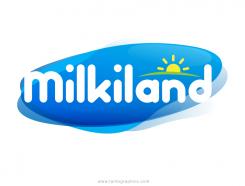
Redesign of the logo Milkiland. See the logo www.milkiland.nl"
Contest details:
Gold
- Contest holder: Yevhen
- Category: Logo design
- Total budget: € 479.00
- Start date : 27-03-2014 14:38
- Ending date : 25-04-2014 14:36
- Status : Ended
- Required formats: jpg,ai,pdf
- Relevant files: None
-
Available languages:


- Number of designs: 178
-
Response rate:
low high
Needs:
2) the only constant thing to keep from the current corporate logo is the word Milkiland. All the other elements of the current logo including colour, font, etc., could be changed or removed
3) the logo should have a simple outline, shape to place it against any background of the package
4) the colors could be blue, green, white, red or any other natural colors to support the idea of dairy products
Why do we need that?
1 The corporate logo Milkiland does not fit for sales of European cheese on the markets of Ukraine, Russia, Asia and other countries.
2 It doesn’t correspond the meaning of cheese or dairy products from the Western Europe. Dutch origin is especially valuable
3 We need to compete with a German brand Hochland (Hochland Kaasland)on the Ukrainian, Russian and other Eastern markets.
4 We can compete if we have a rather Dutch name and image of the brand
The other Competitors:
Arla, Milkana, Valio, Bel, President (Lactalis), Milchland
Company description:
Target group:
Colors, favourites and other requirements
apdsgn
-
-
Description by designer apdsgn:
Dear Yevhen,
I worked in some new ideas according to what you mentioned in a previous message. Please let me know if any of these concepts feel better for Milkiland and if you need any modifications. -
Yevhen says :
the font like hand written is not good
see Hochland - that is the competitor to be in the line with -
This contest is finished. Its not possible to reply anymore.
-
-
-
Description by designer apdsgn:
Dear Yevhen,
I worked in some new ideas according to what you mentioned in a previous message. Please let me know if any of these concepts feel better for Milkiland and if you need any modifications. -
Yevhen says :
rather milky, not connected with cheese
-
This contest is finished. Its not possible to reply anymore.
-
-
-
Description by designer apdsgn:
Dear Yevhen,
I worked in some new ideas according to what you mentioned in a previous message. Please let me know if any of these concepts feel better for Milkiland and if you need any modifications. -
Yevhen says :
This is really good and one of the best for the moment, but not final
thanks -
apdsgn says
Thank you for the rating and feedback Yevhen, could you please let me know what would you like different or what would you prefer to adjust in this option so I can move forward more strategically. Thanks in advance and looking forward to your comments!
-
This contest is finished. Its not possible to reply anymore.
-
-
-
Description by designer apdsgn:
Dear Yevhen,
I worked in some new ideas according to what you mentioned in a previous message. Please let me know if any of these concepts feel better for Milkiland and if you need any modifications. -
Yevhen says :
milky, not bad, but not bright for premium cheese like Hochland logo is
-
This contest is finished. Its not possible to reply anymore.
-
-
-
Description by designer apdsgn:
Dear Yevhen,
Here is an idea for the Milkiland logo. The color palette is very similar to the old one but now it's a bit bolder but abstract at the same time. Please let me know if the style fits your goals or if you need any modifications. Happy to help.
Best regards,
apdsgn -
Yevhen says :
Hello,
it's sunny, funny, milky, but does not fit for cheese. We make cheese.
When "Milkiland" written in white it is not good
-
apdsgn says
Thank you for the quick and constructive feedback! I will take a different direction and show you some new ideas soon.
-
This contest is finished. Its not possible to reply anymore.
-

