Redesign of the logo Milkiland. See the logo www.milkiland.nl"
Contest details:
Gold
- Contest holder: Yevhen
- Category: Logo design
- Total budget: € 479.00
- Start date : 27-03-2014 14:38
- Ending date : 25-04-2014 14:36
- Status : Ended
- Required formats: jpg,ai,pdf
- Relevant files: None
-
Available languages:


- Number of designs: 178
-
Response rate:
low high
Needs:
2) the only constant thing to keep from the current corporate logo is the word Milkiland. All the other elements of the current logo including colour, font, etc., could be changed or removed
3) the logo should have a simple outline, shape to place it against any background of the package
4) the colors could be blue, green, white, red or any other natural colors to support the idea of dairy products
Why do we need that?
1 The corporate logo Milkiland does not fit for sales of European cheese on the markets of Ukraine, Russia, Asia and other countries.
2 It doesn’t correspond the meaning of cheese or dairy products from the Western Europe. Dutch origin is especially valuable
3 We need to compete with a German brand Hochland (Hochland Kaasland)on the Ukrainian, Russian and other Eastern markets.
4 We can compete if we have a rather Dutch name and image of the brand
The other Competitors:
Arla, Milkana, Valio, Bel, President (Lactalis), Milchland
Company description:
Target group:
Colors, favourites and other requirements
damjan
-
-
Description by designer damjan:
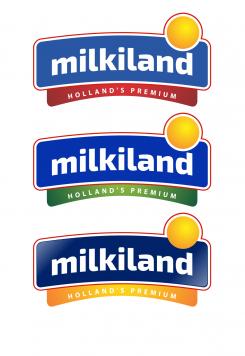
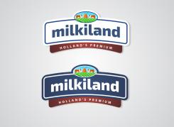
Hi! Here are thre versions of the blue shade. First one is blue similar to "Hochland" blue (as far as I was able to decode it), second one is brighter dark blue (solid PANTON color) and the third one is with glossy/glass effect. Is this closer to your wishes?
-
Yevhen says :
Thanks.
I'll be back with my comments
If we would make some adjustments after 26 of April. it would be great to have contacts
my mail is y.mulyarchuk@1inc.kiev.ua -
damjan says
Hi. Thanks for replying. Think there's no need in leaving your contacts here, as you will be able to see contact details for designers (me), once you select the winner. I'm available for additional consultations, of course!
-
This contest is finished. Its not possible to reply anymore.
-
-
-
Description by designer damjan:
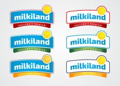
Hi! Thanks for your comment. Here're versions with added brightness. As to red outline, I'm proposing other versions too. My favorite is #2 (with bright blue outline) in both, blue and outline logos. But it's to you to choose.
-
Yevhen says :
thanks
for the East Europe and especially Ukraine brightness is important -
Yevhen says :
Could you leave the dark blue colour as it was inside previously and add a red outline please?
-
Yevhen says :
Could you please try to chang the main blue color? the last is not bright, the previous is maybe dull.
Please compare the version with our competitors - Valio, Hochland, Arla, Milkana, Frico, President.
We should be as bright as they are.
The logos of the competitors are available here.
http://www.ex.ua/136742679474
or https://drive.google.com/file/d/0B3ra5RoWe4H1T1ducktpd2dMWGM/edit?usp=sharing
Yevhen -
damjan says
Ok. I'll make changes later in the day, since I'm not on my post right now. I get what you want and will do changes as requested. Previous blue was based on Netherlands flag's blue (i've used the same color codes). I'm mentioning this because this color may seem dull on screen, but I think it looks brighter in real life (can you confirm that for me?).
-
Yevhen says :
The previous looks dull when printed also. Not even dull actually but not bright comparing to the competitors.
It should be rather dark and bright
Thanks -
Yevhen says :
let's work only with left darker images where Milkiland is written white
-
This contest is finished. Its not possible to reply anymore.
-
-
-
Description by designer damjan:
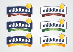
As per your request, with red, green and gold ribbon.
-
Yevhen says :
thanks
-
Yevhen says :
thanks
-
Yevhen says :
Please add brithness to your concept, make the outline red.
See Hochland, Milkana - they are catchy.
Yevhen -
This contest is finished. Its not possible to reply anymore.
-
-
-
Description by designer damjan:
Full sun logo
-
Yevhen says :
That's Ok
you had a brown bottom stripe. Could you please show it with a brown one? -
This contest is finished. Its not possible to reply anymore.
-
-
-
Description by designer damjan:
Milkiland with the sun
-
Yevhen says :
we did not mean it was a cloud.
We reckon it has to be a full circle -
This contest is finished. Its not possible to reply anymore.
-
-
-
Description by designer damjan:
Milkiland with cheese
-
Yevhen says :
It could be cheese, but please make also a full circle - no rays, no cheese.
Any other ideas to develop the logo are welcomed -
This contest is finished. Its not possible to reply anymore.
-
-
-
Description by designer damjan:
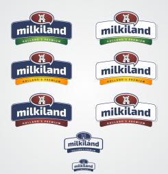
Dear Yevhen, Thank you for your rating and comment. I understand your concern about visibility on small applications. Therefor, I submit this redesigned solution. I've left the windmill as a key part of the ornament (we have to address the brand's origin, it's one of your sales key points), and redone the ornament shape (more of a drop). Thinking it over, there's no need in adding elements like cows or medows, since the brand name itself is extremely descriptive and understandable. This design can withstand downsizing and if that's not enough since it's so simple it can be used in outline (last two versions on this submission). Outlined in one color can be used for extremely small (2 cm) sizes and still provide enough for buyer to recognize the brand.
-
Yevhen says :
Thank you, we'll think of it and I'll be back with more commments
-
Yevhen says :
ok
let's remove that upper oval with a mill and make a yellow round spot above the "nd" letters of "Milkiland" in the right corner like a sun without rays or cheese.
That round spot should step a bit out of the frame of the logo.
Please make a few versions of it.
Yevhen -
This contest is finished. Its not possible to reply anymore.
-
-
-
Description by designer damjan:
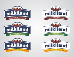
As per your request, here's an elaboration of color coding suggestion. I've used both logos (white and blue) to show that you can work on your brand diversity only by changing the color of the ribbon) or you can use it in combinations with brand slogans ("Low fat...", "Holland Quality..." etc.).
-
damjan says
Also, I've increased the size of the upper emblem, but I'm against increasing the image in emblem to the size other designers use. That would make the emblem take over the name which is quite good and catchy (very english-like and recognizable).
-
Yevhen says :
Ok,
that's it. we'll think of it
Thanks.
Yevhen -
This contest is finished. Its not possible to reply anymore.
-
-
-
Description by designer damjan:
Same logo with flag color, but with emblem in same color (for simplified production and general feel of simplicity).
-
Yevhen says :
I think it looks really good and premium
thanks -
damjan says
Thanks for rating and comment, but please share if there's something you would like me to change?
-
Yevhen says :
Hello,
If you could try to show your idea of the line - show those different colors of the bottom part. 3 versions to present the line would be enough.
Another thing it's maybe try to make a little bit bigger the upper oval part where the land is
thanks
Yevhen -
This contest is finished. Its not possible to reply anymore.
-
-
-
Description by designer damjan:
Two versions of logo with colors from Netherland's flag (blue, red and white - actual shades) to add more national origin flavor.
-
Yevhen says :
the same - good
-
Yevhen says :
Hi,
please try to develop that concept changing the meadow, mill and the cows on the center of the oval.
Look if we have the logo small-size on the real package nobody would see what is inside the oval.
Try to find something what is seen when the logo is small
Thanks
Yevhen -
This contest is finished. Its not possible to reply anymore.
-
-
-
Description by designer damjan:
Logo with red ribbon and added cows in the emblem above.
-
damjan says
I would suggest that different colors of the ribbon (on which "Holland's Premium" is written) you can use for color coding of your product lines, ie. top-shelf cheese gets the red ribbon, low-fat products green and standard products blue. Just an idea. :)
-
Yevhen says :
A good idea
thanks -
This contest is finished. Its not possible to reply anymore.
-
-
-
Description by designer damjan:
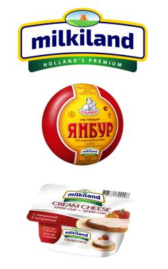
Wanted to show the application of the logo, but wasn't able to find larger pics of your products. Therefore, sorry for small pic. :) Hope you like it. Any comment would be much appreciated.
-
This contest is finished. Its not possible to reply anymore.
-
-
-
Description by designer damjan:
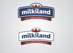
Also a version with blue background and "Holland's Premium" subtitled. Any feedback would be much appreciated.
-
This contest is finished. Its not possible to reply anymore.
-
-
-
Description by designer damjan:
Thanks for rating and comment. Glad you liked my ideas. Here's a version with white background (as per your request) and added Holland's Premium.
-
This contest is finished. Its not possible to reply anymore.
-
-
-
Description by designer damjan:
I've understood that the main goal of redesign is to appeal to consumers in exporting countries? For that reason, I've used windmill as most recognizable representation of Netherlands. Also, we could add "Product of Netherlands/Holland", "Holland's Premium" somewhere in the logo.
-
Yevhen says :
Hello,
the version looks really not bad.
maybe try revers colors. Blue word "milkiland" on a white.
thanks
Yevhen -
Yevhen says :
Hello
you have got the the right idea.
"Holland's Premium" could be really valuable, but not the "Product of Metherland" I reckon. It could be not correct
thank you
Yevhen -
Yevhen says :
Hello
you have got the the right idea.
"Holland's Premium" could be really valuable, but not the "Product of Metherland" I reckon. It could be not correct
thank you
Yevhen -
This contest is finished. Its not possible to reply anymore.
-

