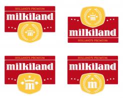
Redesign of the logo Milkiland. See the logo www.milkiland.nl"
Contest details:
Gold
- Contest holder: Yevhen
- Category: Logo design
- Total budget: € 479.00
- Start date : 27-03-2014 14:38
- Ending date : 25-04-2014 14:36
- Status : Ended
- Required formats: jpg,ai,pdf
- Relevant files: None
-
Available languages:


- Number of designs: 178
-
Response rate:
low high
Needs:
2) the only constant thing to keep from the current corporate logo is the word Milkiland. All the other elements of the current logo including colour, font, etc., could be changed or removed
3) the logo should have a simple outline, shape to place it against any background of the package
4) the colors could be blue, green, white, red or any other natural colors to support the idea of dairy products
Why do we need that?
1 The corporate logo Milkiland does not fit for sales of European cheese on the markets of Ukraine, Russia, Asia and other countries.
2 It doesn’t correspond the meaning of cheese or dairy products from the Western Europe. Dutch origin is especially valuable
3 We need to compete with a German brand Hochland (Hochland Kaasland)on the Ukrainian, Russian and other Eastern markets.
4 We can compete if we have a rather Dutch name and image of the brand
The other Competitors:
Arla, Milkana, Valio, Bel, President (Lactalis), Milchland
Company description:
Target group:
Colors, favourites and other requirements
khatika
-
-
khatika says
Hello,
I understood that you were not very much in favor of a more modern style but that you want to follow Hochland, but what will happen when Hochland change its logo as Valio did ... I hope you will reconsider the matter and will rather want to be a leader than a follower.
I say this not just for my logo, I am aware that something is missing in my designs, but I think I found a typography particularly recognizable and suitable for your business, and which is sufficient in itself, isn' it?
Especially since it can create a real logo ...
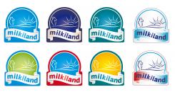
Regarding color, let me suggest that you use green, insofar as blue is for milk and yellow for cheese, mixing the two to get a nice green seems to me the most relevant. (in my humble opinion)
Best Regards,
Catherine. -
khatika says
oh ok, I've just read your comment on mattdesign's, about the tastes of East customers, obviously in this context a modern design wouldn't be suitable. That said, it is sad (in terms of design).
-
Yevhen says :
Yes, it's sad. Sometimes we choose not what we like to
-
This contest is finished. Its not possible to reply anymore.
-
-
-
No comments
-
This contest is finished. Its not possible to reply anymore.
-
-
-
No comments
-
This contest is finished. Its not possible to reply anymore.
-
-
-
No comments
-
This contest is finished. Its not possible to reply anymore.
-
-
-
No comments
-
This contest is finished. Its not possible to reply anymore.
-
-
-
No comments
-
This contest is finished. Its not possible to reply anymore.
-
-
-
No comments
-
This contest is finished. Its not possible to reply anymore.
-
-
-
No comments
-
This contest is finished. Its not possible to reply anymore.
-
-
-
No comments
-
This contest is finished. Its not possible to reply anymore.
-
-
-
No comments
-
This contest is finished. Its not possible to reply anymore.
-
-
-
Yevhen says :
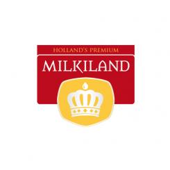
could be if not so simple. It's rather royal, not premium
thanks -
khatika says
Hello Yevhen,
Thank you for your feedback, I thought to a crown over the fact that you are one of the few countries to have a monarch, and the name "Milkiland" suggests me a land that deserves his queen :)
But you're right, this logo is too empty, I'll try to do better for the next proposals.
Regards,
Catherine. -
This contest is finished. Its not possible to reply anymore.
-
-
-
No comments
-
This contest is finished. Its not possible to reply anymore.
-

