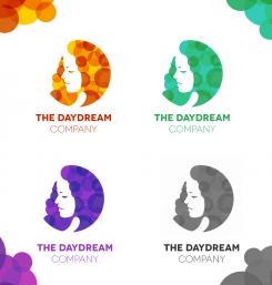
The Daydream Company needs a super powerfull funloving all defining spiffy logo!
Contest details:
Bronze
- Contest holder: dezieray
- Category: Logo design
- Total budget: € 229.00
- Start date : 12-12-2013 14:22
- Ending date : 20-01-2014 12:48
- Status : Ended
- Relevant files: None
-
Available languages:


- Number of designs: 132
-
Response rate:
low high
Needs:
Company description:
Target group:
Colors, favourites and other requirements
YoungZdesigner
-
-
Description by designer YoungZdesigner:
Hello there,
here is my first entry. I had no idea how to create your logo, but then I created this universal one in 4 color previews.
And now why universal..
The first thing you may notice are layered circles which represent rest and dreams (DayDream). You know the feeling when you close your eyes and before your lids appear a little blurry circle, in photography called "bokeh"? That's what I thought.
The face which you can see do not represent women or female gender, but it's face of fairy, which is one of the most popular symbols of dreams. Some people who were under hypnosis also said that they met with the fairies or otherworldly beings.
When you look at the logo, you may think that she is lost in lots of circles, someone may think that circles are in fact her hair. This is the reason why I created what I created. The person need to spend some time by thinking: "What it actually is? Leaves, woman, circles, moon or..?"
Well, this is a short characterization, just to tell you, what was my main mind or point :)
I didn't found your website and so I just did it with thoughts that came into my mind.
Thanks in advance for any feedback!
Denise -
dezieray says :
Hi Denise, thank you for your design and the information! I like what you have done and I like your way of thinking, however I do not resonate with these images. I find it hard to give good feedback because I don't know what I want until I see it.... I like a more 50's look and feel. Warm colors, bold typeface. thanks again, desiree
-
dezieray says :
Thank you for your design(s). I appreciate all the time and effort that was put in all the designs by a variety of designers. Unfortunately, by the end of the contest none of the designs spoke to me so there was no winning design. When the contest ended I was no longer able to communicate with the designers. I then learned of the possibility to prolong the contest and so I did. During the contest I also kept looking around for what I was looking for in my design. I have learned what does and does not appeal to me. So however clever some of the designs were, I now know that I’m drawn to a certain look and feel (as described in the briefing). Maybe you want to stay in the contest, in that case I wish you good luck! Maybe you no longer wish to enter, in that case I thank you for your work! Kind regards, Desiree
-
YoungZdesigner says
Hello dezieray,
thanks a lot for your message. I apologize for late reply, but I was not on-line on brandsupply for some days.
It is absolutely perfect, that no one design spoke to you! If I understand you message correctly, may I create new design and upload it here?
Is this contest still open till 20.1.2014?
I have also one question. You uploaded image of some "vintage text logo". Is this style that you like? Do you like vintage feel, typography, "Underground U.S. Style", combination of two-three fonts at the same time?
Do you have any other images for inspiration or do you have in your mind some "character or symbol" which you like and want to have in the logo?
Once I receive your reply, I will think about that and as the case may be, I will create new logo.
Thanks in advance.
Denise -
YoungZdesigner says
Vintage logos from the internet:
http://blog.spoongraphics.co.uk/wp-content/uploads/2012/vintage-logo/black-denim-logo.jpg
http://designshack.net/wp-content/uploads/dsretrologos-0.jpg
This one is very creative: http://image.shutterstock.com/display_pic_with_logo/946831/113534800/stock-vector-gentleman-s-skull-logo-design-vintage-skull-collection-113534800.jpg
Complex, but effective: http://designspiration.net/data/l/480575316531_wFDGZ1Vj_l.jpg
Very powerful one: http://www.downgraf.com/wp-content/uploads/2012/05/1016.jpg -
This contest is finished. Its not possible to reply anymore.
-

