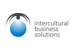
Young intercultural company looking for it's logo
Contest details:
Silver
- Contest holder: M.Violin
- Category: Logo design
- Total budget: € 329.00
- Start date : 23-06-2015 00:15
- Ending date : 11-07-2015 00:08
- Status : Ended
- Required formats: jpg,ai,pdf
- Relevant files: None
-
Available languages:


- Number of designs: 104
-
Response rate:
low high
Needs:
Company description:
Our company has been founded in February 2015 and deals predominantly in anything that pertains to intercultural business, from consultancy to assistance and facilitaion. We provide tailor made solutions to businesses as well as private individuals in any sector where this may be required through our extensive network.
Target group:
Our main target concerns businesses that do inter(national/cultural) business. predominantly in Europe our network extends worldwide. Furthermore, we are in the business of aiding expats, to immigrate and emigrate from A to B, wherever that may be, and assist them with any challenges they may encounter.
Our services comprehend but are not limited to (inter ntaional/cultural): Finance, Logistics, Legal, Recruitment and Selection, Property Management, Administration etc.
Colors, favourites and other requirements
We are looking for a unique, simple and elegant logo that expresses our know how.
During a brainstorming session we have come up with the idea of a spider juxtaposed on the world, covered by it's web.
The symbolism behind it was the company as dominating the web, to emphasize our know-how.
The web would symbolize the nodes and contactpoints we provide and handle.
The world would stand for multiculturalism.
We had trouble relating this to what ultimately is more important : the elegant and simple prerequisite. Furthermore it is absolutely not desireable that the logo can be mixed up with something else (ie : spiders very easily related to spiderman)
We were personally thinking of 2 colors : silver/chrome and blue to emphasize our trustworthiness.
We have attached several googled pictures to give an idea of what may be incorporated in the above mentioned logo.
Then again, we are open to completely different suggestions, the most important thing to us is that it is a unique, simple and elegant logo that oozes professionalism.
stevan banjac
-
-
M.Violin says :
Dear Stevan,
Thank you for your submission!
The abstract approach you took has led to you having quite the fanbase here !
There were some reserves however regarding the black element, general consensus was it looks a bit curious as is. We were wondering if you would be able to remove the "head" of the spider and instead add two smaller arches underneath the ones you already made. Furthermore, we would prefer it if there was no element floating above the sphere but that the two elements be incorporated one in another to form a circle. The upper part would have the arches/legs and the lower part would be blue as in your design.
We don't know if in the new design a light effect would look nice but we leave that entirely up to you.
Regarding the company name we would prefer it the first letter of each word be put in capital letters. We appreciate the height of the text being the same as the sphere's. We were also wondering if you could give the text slightly more poise? maybe the capital letters help or putting it in bold? Perhaps a different lettertype would be better? We leave it up to you.
Your design has a lot of potential and we hope to see more from you.
Best,
M. -
This contest is finished. Its not possible to reply anymore.
-

