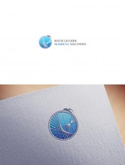
Young intercultural company looking for it's logo
Contest details:
Silver
- Contest holder: M.Violin
- Category: Logo design
- Total budget: € 329.00
- Start date : 23-06-2015 00:15
- Ending date : 11-07-2015 00:08
- Status : Ended
- Required formats: jpg,ai,pdf
- Relevant files: None
-
Available languages:


- Number of designs: 104
-
Response rate:
low high
Needs:
Company description:
Our company has been founded in February 2015 and deals predominantly in anything that pertains to intercultural business, from consultancy to assistance and facilitaion. We provide tailor made solutions to businesses as well as private individuals in any sector where this may be required through our extensive network.
Target group:
Our main target concerns businesses that do inter(national/cultural) business. predominantly in Europe our network extends worldwide. Furthermore, we are in the business of aiding expats, to immigrate and emigrate from A to B, wherever that may be, and assist them with any challenges they may encounter.
Our services comprehend but are not limited to (inter ntaional/cultural): Finance, Logistics, Legal, Recruitment and Selection, Property Management, Administration etc.
Colors, favourites and other requirements
We are looking for a unique, simple and elegant logo that expresses our know how.
During a brainstorming session we have come up with the idea of a spider juxtaposed on the world, covered by it's web.
The symbolism behind it was the company as dominating the web, to emphasize our know-how.
The web would symbolize the nodes and contactpoints we provide and handle.
The world would stand for multiculturalism.
We had trouble relating this to what ultimately is more important : the elegant and simple prerequisite. Furthermore it is absolutely not desireable that the logo can be mixed up with something else (ie : spiders very easily related to spiderman)
We were personally thinking of 2 colors : silver/chrome and blue to emphasize our trustworthiness.
We have attached several googled pictures to give an idea of what may be incorporated in the above mentioned logo.
Then again, we are open to completely different suggestions, the most important thing to us is that it is a unique, simple and elegant logo that oozes professionalism.
2ND
-
-
Description by designer 2ND:
Hello again :)
I did this simple change but I think it looks better already. Suggestion was good.
2ND. -
M.Violin says :
Dear 2ND,
Thank you for this new design, we agree with you it looks better and will most likely be the winner except that the resolution is really low and when we enlarge the logo it looks really grainy.
Could you improve on that?
Congratulations again on your high potential design.
Best,
M. -
2ND says
Hello and thank you again.
This is just JPEG (image) with logo on it.
You will get vector at end of contest and vector have unlimited quality If we talk about resolution.
Best regards, 2ND. -
2ND says
https://en.wikipedia.org/wiki/Vector_graphics
-
This contest is finished. Its not possible to reply anymore.
-
-
-
M.Violin says :
Dear 2ND,
Thank you for your submission.
You have wowed everybody in the office with your elegant yet simple design. It is a serious contender to win the competition.
The concern that has been expressed the most is that the spider looks very intimidating. We realize that this is also what we wanted but maybe the emphasis on the spider can be reduced somewhat.
Our suggestion was to not change anything but how big the letters are. We would like to see exactly the same design and the same layout but with the letters being as big as the sphere ( not as high as the spider ). This will draw the eye away from the creature. Please try to not make the logo too long if possible.
We hope that you are willing to accommodate us in our request and are open to any suggestions comments and questions you may have to improve your design and namely the aggressive nature of the spider.
With kind regards,
M. -
2ND says
Hello.
Thank you for your comment.
I'm glad that you like my work.
I will do the changes.
Best regards,
2ND.
-
This contest is finished. Its not possible to reply anymore.
-


