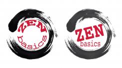
Zen Basics is my clothing line. It has different shades of black and white including white, cream, grey, charcoal and black. I use red for the logo and put the words in an enso (a circle made with a b
Contest details:
Silver
- Contest holder: Bronwengrant
- Category: Logo design
- Total budget: € 299.00
- Start date : 30-12-2014 02:53
- Ending date : 13-01-2015 02:50
- Status : Ended
- Required formats: jpg,ai,pdf
- Relevant files: None
-
Available languages:

- Number of designs: 40
-
Response rate:
low high
Needs:
What I need is a unique circular brush stroke with the words Zen Basics. I'm attaching a picture for reference.
Company description:
The company is zyza.ca it is a yoga clothing company with a line called zen basics.
Target group:
Target group is white women age 45 and up in my local area.
Colors, favourites and other requirements
rgmj
-
-
Description by designer rgmj:
Hi, I've kept the brush stroke you provided that is good as is. The font I used is simple and clear to underline the 'basics' aspect of your clothing line. For readability the logo on the right is better; the left one however is slightly more lighthearted and fun.
-
This contest is finished. Its not possible to reply anymore.
-

