Axendo brand redesign
Contest details:
Gold
- Contest holder: Axendo
- Category: Logo & stationery
- Total budget: € 449.00
- Start date : 14-02-2013 11:12
- Ending date : 21-03-2013 11:05
- Status : Ended
- Required formats: jpg,ai,pdf, indd, eps
- Relevant files: None
-
Available languages:

- Number of designs: 181
-
Response rate:
low high
Needs:
//Our clients
Due to the economic downturn, for virtually all businesses and organizations their competitive position and the available budgets are under pressure. "Doing more for customers and relationships with fewer people and resources" is the motto. One way to achieve this is to invest in new, web-based technologies.
A multidisciplinary project team is usually set up that defines the requirements. And they look for the most suitable party for the realization.
Today, no organization can afford any negative surprises. This puts high demands on the processes and procedures of the agency to select. These are often complex, innovative projects that have progressive insights. While the outlines for planning and budgets very strict.
Company description:
//About us
Axendo is an ambitious, innovative club with remarkable and successful web projects for medium and large organizations. We build websites, web-applications and apps for mobile or tablet use.
The most important USP for Axendo is the synergy between state-of-the-art web technology and excellent project management. This creates a very efficient way for Axendo to combine innovation and maximum customer satisfaction.
This proposition for Axendo seamlessly links to the complexity of web projects, the importance of good technology, the defined budgets and the strong need for the target to be 'in control'.
In addition, Axendo has a number of proven solutions 'on the shelf'. Products already developed of which customers can benefit immediately.
Target group:
Our main customers are
- national and international businesses
- advertising or design agencies who we collaborate with
Colors, favourites and other requirements
We like to show that we are both reliable and innovative. A simple brand that says we're ambitious, innovative and transparent.
keesvanbeek
-
-
Description by designer keesvanbeek:
Dear Sir / Madam,
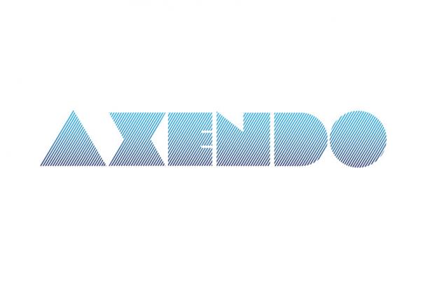
Again, the lines symbolize the synergy between Axendo and their client(s). With the "open" letter is also the 'transparent' method of working supported. Of course, other variants of color usage is possible.
I'm looking forward to your reply,
With kind regards,
Kees van Beek -
This contest is finished. Its not possible to reply anymore.
-
-
-
Description by designer keesvanbeek:
Dear Sir / Madam,
Attached a new logo proposal. This designs contains also the transparant working method. Except, in this proposal is the 'transparancy' captured by 'Do'. Doing business together in a transparant, open and hardworking way.
I'm looking forward to your response.
Sincerely,
Kees van Beek -
This contest is finished. Its not possible to reply anymore.
-
-
-
Description by designer keesvanbeek:
Dear Sir / Madam,
Attached is a variant of the previously proposed logo design.
I'm looking forward to your reply.
Sincerly,
Kees van Beek -
This contest is finished. Its not possible to reply anymore.
-
-
-
Description by designer keesvanbeek:
Dear Sir / Madam,
Attached my logo proposal. A brief explanation, each letter of the name Axendo consists of 2 colored lines. A dark one and a light line. These 2 lines symbolize the cooperation (synergy) between Axendo and their client(s). With the "open" letter is also the 'transparent' work supported. Of course, other variants of color usage is possible.
I'm looking forward to your response.
Sincerely,
Kees van Beek -
This contest is finished. Its not possible to reply anymore.
-

