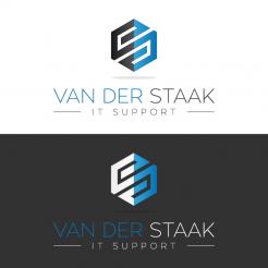
Catching logo and brand for a starting IT company
Contest details:
- Contest holder: dvdstaak
- Category: Logo & stationery
- Total budget: € 100.00
- Start date : 21-11-2015 14:45
- Ending date : 05-12-2015 14:34
- Status : Ended
- Required formats: jpg,psd,ai,pdf
- Relevant files: None
-
Available languages:


- Number of designs: 42
-
Response rate:
low high
Needs:
Company description:
Everything with a computer, phone or other IT related technology is within my area of expertise and I provide assistance for. If i can't do it remotely, I will do so on-site.
I'm very flexible in working hours. For small to medium businesses this means i'm also available outside of work hours. This means that work can continue for out-of-business hours support.
Target group:
My target audiences are small and medium businesses, and deafblinds (being both auditory and visually impaired).
Colors, favourites and other requirements
Preferably I would have a logo that can be reversed in colors. I mean that the logo would be both in "normal" and in inversed colors, would be a good logo. This is because visually impaired often work with inversed colors. This is a wish, not a requirement.
VirtualLies
-
-
Description by designer VirtualLies:
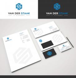
Thank you for your positive feedback and rating, attached the combination of both first proposals with a bolder font for the headline, including the corresponding housestyle. Looking forward to your reply, best regards, Dagmar Lange
-
This contest is finished. Its not possible to reply anymore.
-
-
-
Description by designer VirtualLies:
Good morning,
attached a new idea... feedback is appreciated ;) Kind regards, Dagmar Lange -
dvdstaak says :
Good morning,
Thank you for your new idea. The last 2 ideas you have posted do not have my preference. The one before, which is the combination of the 2 first ones, still holds my preference.
-
This contest is finished. Its not possible to reply anymore.
-
-
-
No comments
-
This contest is finished. Its not possible to reply anymore.
-
-
-
dvdstaak says :
Erg pakkend, en ziet er ook omgekeerd erg strak uit!
Nu vind ik vooral het hoekige van het 2e ontwerp, en de kleur van het eerste ontwerp erg mooi. Ik weet alleen niet of dit te combineren is, of dat het dan afgrijselijk wordt?
Verder zijn de letters aan de dunne kant, maar ik kan niet zeggen of dat het even goed uit ziet als ze net een tikje dikker zijn. Ik hoop dat ik niet te pietje precies ben! -
This contest is finished. Its not possible to reply anymore.
-
-
-
No comments
-
This contest is finished. Its not possible to reply anymore.
-

