Corporate Identity and Logo Design for Coach & Trainer
Contest details:
Silver
- Contest holder: Thomasmueller
- Category: Logo & stationery
- Total budget: € 349.00
- Start date : 28-08-2013 18:39
- Ending date : 10-10-2013 18:38
- Status : Ended
- Required formats: psd,ai,pdf
- Relevant files: None
-
Available languages:


- Number of designs: 184
-
Response rate:
low high
Needs:
Training und Coaching in Words are necessary. perhaps the logo between them. For instance like: http://www.brandsupply.de/logo_corporate_design/funnelfactory-logo-and-style/designs/12933
Company description:
I'm searching for designers that are capable of designing a powerful yet pleasant Logo and Corporate Identity for TM Training und Coaching.
The style we are aiming for is young, dynamic, tight, simple and contemporary. In terms of colors orange, Blue, Grey, Lila or green in dull graduations.
Tm Training and Coaching is enthusiastic Coaching and Training company that (amongst other things) specializes on training and coaching Salespeople. We are specialized on Neuromarketing and all aspects of sales activities.
Target group:
sales management
purchasing manager
human resources department
employee representative
Colors, favourites and other requirements
Colours: soft green and soft grey (like the pics)
ParLaBello
-
-
Thomasmueller says :
Mmmh.At first thx for the new proposal.I am sorry but I really think that isnt my design.Only a gut feeling. :-(
-
This contest is finished. Its not possible to reply anymore.
-
-
-
Description by designer ParLaBello:
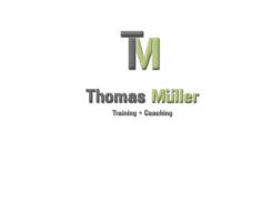
Hi, I understood your comment on my first design. The two bars at both sides of the T where parts of a M, but you couldnt see it that good. In my new design I did something else to combine the T and the M.
I hope you like it, and I would like some feedback.
Greetings,
Jefry
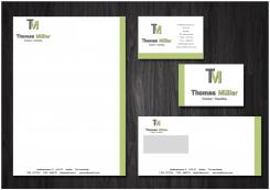
Ps. Ill set up a stationary tomorrow. -
This contest is finished. Its not possible to reply anymore.
-
-
-
Thomasmueller says :
Hey Jefry.Thx for your suggestion.But in this case, Jefry,but I am not sure to say yes thats it.I think the issue is the green bars next to the T.Sorry but Thx!
-
This contest is finished. Its not possible to reply anymore.
-
-
-
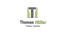
Description by designer ParLaBello:
Here is my design.
I would like some feedback.
Greetings,
Jefry Albers -
Thomasmueller says :
Hey Jefry.Thx for your suggestion.But in this case, Jefry,but I am not sure to say yes thats it.I think the issue is the green bars next to the T.Sorry but Thx!
-
This contest is finished. Its not possible to reply anymore.
-


