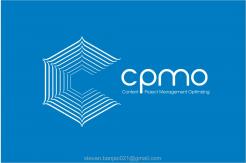
CPMO is the spider in the web
Contest details:
- Contest holder: CPMO
- Category: Logo & stationery
- Total budget: € 199.00
- Start date : 15-03-2014 22:43
- Ending date : 24-03-2014 22:38
- Status : Ended
- Required formats: jpg,ai,pdf,png
- Relevant files: None
-
Available languages:


- Number of designs: 51
-
Response rate:
low high
Needs:
If you can, then we dare you. We already have an idea about the logo: we would like to see CPMO written in black, round letters, with half a spider web emerging from the outlines of the C. The spiderweb would be gray and just like it was sketched with a pencil.
Too specific for you? Of course we would love to see what else you can come up with. After all, you are the creative mastermind.
For the winning designer it should be good to know that other assignments from within our network could come from this one.
Too specific for you? Of course we would love to see what else you can come up with. After all, you are the creative mastermind.
For the winning designer it should be good to know that other assignments from within our network could come from this one.
Company description:
Target group:
Companies, big and small, that could use a different perspective on business when it comes to content, communication, project leadership or project organisation.
Colors, favourites and other requirements
stevan banjac
-
-
CPMO says :
Dank je wel voor je inzending. We waarderen je grafische kijk op ons thema en vinden ook de uitlopende P die in de regel eronder de plaats van het & teken inneemt goed opgelost. Hoewel we het logo mooi vinden, past het niet bij onze identiteit. We zullen je daarom niet vragen deze verder uit te werken.
-
This contest is finished. Its not possible to reply anymore.
-

