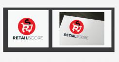
Create a catchy logo & branding for a new Sales & Merchandising agency in NL
Contest details:
Gold
- Contest holder: monster
- Category: Logo & stationery
- Total budget: € 449.00
- Start date : 08-08-2013 16:33
- Ending date : 22-08-2013 16:20
- Status : Ended
- Required formats: jpg,ai,pdf
- Relevant files: None
-
Available languages:


- Number of designs: 104
-
Response rate:
low high
Needs:
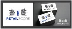
The logo could/should have a link with shops and / or people. Which 2 are central.
Company description:
As Sales & Merchandising Agency Retailscore sends her experienced merchandisers, commissioned by manufacturers / service providers to the stores where their products are. Our merchandisers install promotional materials (POS), furnish shelves or sell displays on the shop floor (most supermarkets).
Target group:
B2B
Colors, favourites and other requirements
We love fairly modern logos and must recognize something in it, which has to do with shops or people. Just a text logo is not what we are looking for.
Laura Roman
-
-
monster says :
The shelfs look at first glance like chinese signs..
-
This contest is finished. Its not possible to reply anymore.
-
-
-
monster says :
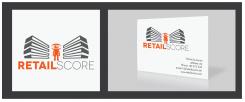
This is a good angle! At last something different from the shopping kart! Good work!
-
Laura Roman says
Thanks, I´m looking to work in this same format with an other optional elements.
-
This contest is finished. Its not possible to reply anymore.
-
-
-
monster says :
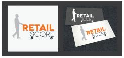
sry, the shopping karts are not what we are looking for. Something with a shop-shelve (schap in een winkel) en een oog, gaat meer in de richting komen. Niemand heeft dat nog!
-
This contest is finished. Its not possible to reply anymore.
-
-
-
No comments
-
This contest is finished. Its not possible to reply anymore.
-
-
-
No comments
-
This contest is finished. Its not possible to reply anymore.
-

