Create a style and logo - with care - for bikes
Contest details:
Silver
- Contest holder: Annie
- Category: Logo & stationery
- Total budget: € 349.00
- Start date : 21-05-2013 22:42
- Ending date : 31-05-2013 22:26
- Status : Ended
- Required formats: jpg,psd,ai
- Relevant files: None
-
Available languages:


- Number of designs: 111
-
Response rate:
low high
Needs:
Services may be extended in the future to selling (customised) bikes and fixies.
Logo will in first place be used for business card, flyer and FB page. Later for website and company vehicle or stickers on bikes.
Company description:
BiciCare:
- Bici stands for Bicycle and comes from Italian (the bike repair man is Italian)
- Care stands for attention and care for the bike (a unique selling point)
Description:
Does your bike need a bit of Care? BiciCare maintains and repairs your bike with attention; as if it was our own bike. And we are happy to come your way, so you save yourself some time and trouble. Your bike is our Care: BiciCare!
Services:
Now: reparations, healthcheck, Care maintenance, mounting online ordered bikes, accessory fixing, service contracts for company or hotel bikes.
Last but not least, the entrepeneur was a professional chef for 15 years. He is making a careerswitch. We may take this theme on board with e.g. pictures to show tools of both professions. Connection is precision, perfection, passion.
Target group:
People in Amsterdam, living or working who own a bike and want to take care of it. They like the convenience of a repair service on location. All ages, but mostly 25-50, online and on social media.
Colors, favourites and other requirements
We are thinking of 2 typefaces for the word BiciCare.
Bici: professional, precise, stands for the bike and the tools
Care: Warm and soft, for the caring and attention
Logo must be self explanatory and better than current similar services.
Most competitors use a bike or a wheel and a lot of orange colour is used. So please NO orange.
It can be a bit playful, but needs to be stylish too.
Possible direction we were thinking for later on the web or banners: white bike on white background, sterile and clean with warm logo (not red as too much red cross alike). Other ideas welcome.
Millwork
-
-
Description by designer Millwork:
Beste,
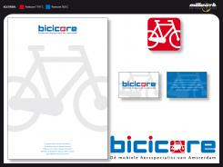
Hoewel uw vorige reactie op de drie kruizen (teken van Amsterdam) erg enthousiast klonk, heb ik ze bij dit ontwerp weggelaten omdat het gewoonweg snel te druk wordt. Gaarne weer op- of aanmerkingen.
Vriendelijke groet,
Martijn (Millwork) -
Annie says :
Hi Martijn, dank voor je nieuwe inzending. Dit spreekt ons helaas niet echt aan.
-
This contest is finished. Its not possible to reply anymore.
-
-
-
Annie says :
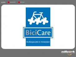
Thanks for the design! I like the link with Amsterdam, nicely found! The total is a bit busy though on the eye I find. Maybe it helps if the crosses are a bit less thick and the name is not in a seperate text box
-
Millwork says
Beste Annie,
We kunnen gewoon Nederlands praten, excuses voor de verwarring die ik gesticht heb, omdat mijn bedrijfje een Engelse naam heeft. Maar haartelijk dank voor de reactie op mijn logo en het is duidelijk wat je zegt, ik ga er verder aan werken.
Vriendelijk dank,
Martijn (Millwork) -
This contest is finished. Its not possible to reply anymore.
-


